MY ROLE
Principal product designer.
Research, user journey, wireframing, prototyping, user testing, UI design, design systems, icons and illustrations, visual design, branding design.
Principal product designer.
Research, user journey, wireframing, prototyping, user testing, UI design, design systems, icons and illustrations, visual design, branding design.
TOOLS
Sketch App, Adobe Illustrator, Adobe Photoshop, InVision, Jira, Confluence.
Sketch App, Adobe Illustrator, Adobe Photoshop, InVision, Jira, Confluence.
ABOUT
Ivideon is a global cloud video surveillance service with more than 3.5 million of active users and more than 900 business partners around the world.
GOALS
• Increase and streamline the growth of user signups, mainly for business accounts.
• Increase and streamline the growth of the quantity of business partners (distributors, installers, vendors).
• Help potential customers to figure out the benefits of the service for various use cases, mainly solutions for business.
• Present more relevant information to the potential business and home customers.
• Reduce the number of phone calls to the customer support team for partnership and pre-sale consultations.
CHALLENGE
Video surveillance was traditionally perceived as a complex bulky system that requires expensive hardware and professional services to install and maintain. Ivideon strives to make video surveillance modern, secure, feature-rich, and available to everyone as a scalable subscription-based service.
Video surveillance was traditionally perceived as a complex bulky system that requires expensive hardware and professional services to install and maintain. Ivideon strives to make video surveillance modern, secure, feature-rich, and available to everyone as a scalable subscription-based service.
This business presented several challenges:
• establish customer trust and convey maturity of the service;
• show the ease of installation and ease of use of the service by both individual customers and businesses;
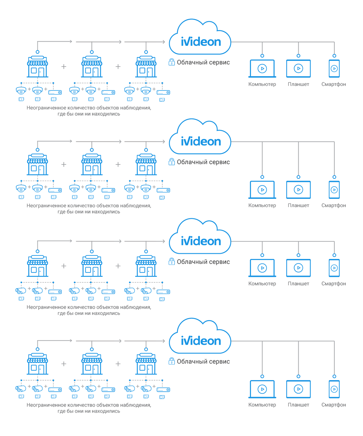
• show how the service enables the customers to quickly scale the video monitoring system up to any number of locations, privately and securely access the connected cameras from anywhere in the world via a single web dashboard, mobile app, or desktop app.
RESULTS
Growth of registered users:
• before: 18,000–26,000 per month;
• after: 64,000–150,000 per month (improvement: +386%).
Growth of registered users:
• before: 18,000–26,000 per month;
• after: 64,000–150,000 per month (improvement: +386%).
Growth of business partners (distributors, installers, vendors):
• before: 40 per year;
• after: 270 per year (improvement: +575%).
• before: 40 per year;
• after: 270 per year (improvement: +575%).
Conversion from website visitors into registered users:
• before: 5%;
• after: 6.5% (improvement: +30%).
• before: 5%;
• after: 6.5% (improvement: +30%).
The number of partnership request phone calls to the customer support team reduced by 37%. The phone calls were replaced by the new partnership request form submits.
The number of pre-sale consultation phone calls to the customer support team reduced by 16%.
The number of home camera purchase orders increased by 21%.
DESIGN PROCESS
The company had already established its brand identity when I joined, so I started with analysis of the existing design, did competitor research, interviewed our team and some of our customers, read the user feedback in the service support channels to learn more. The design I inherited was focused primarily on individual customers: plastic look of the design elements and cartoon illustrations were meant to convey familiarity and friendliness to a home user.
The company had already established its brand identity when I joined, so I started with analysis of the existing design, did competitor research, interviewed our team and some of our customers, read the user feedback in the service support channels to learn more. The design I inherited was focused primarily on individual customers: plastic look of the design elements and cartoon illustrations were meant to convey familiarity and friendliness to a home user.
Ivideon website circa 2011 with cartoon illustrations
(the inherited initial design)
I conducted a user study to understand who the users were, what they were looking for, how the current website was working for them, and how to improve their experience. Most of the customers at the time were business owners who used the service to monitor their premises, others relied on the service for home monitoring.
User study: home users and business users, potential usage scenarios
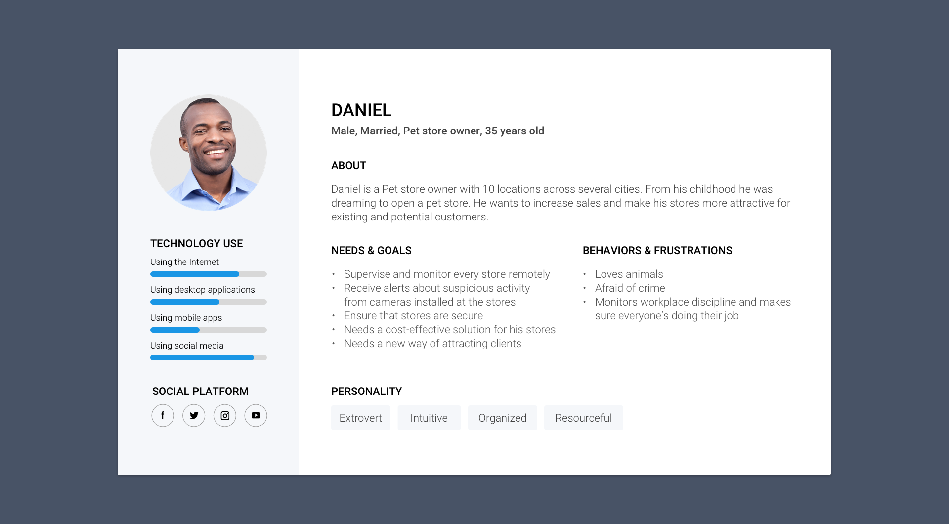
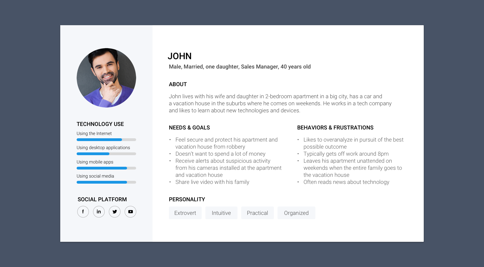
Personas
From my research, I constructed personas and explored their motivations, how they would use a video monitoring web application.
From my research, I constructed personas and explored their motivations, how they would use a video monitoring web application.

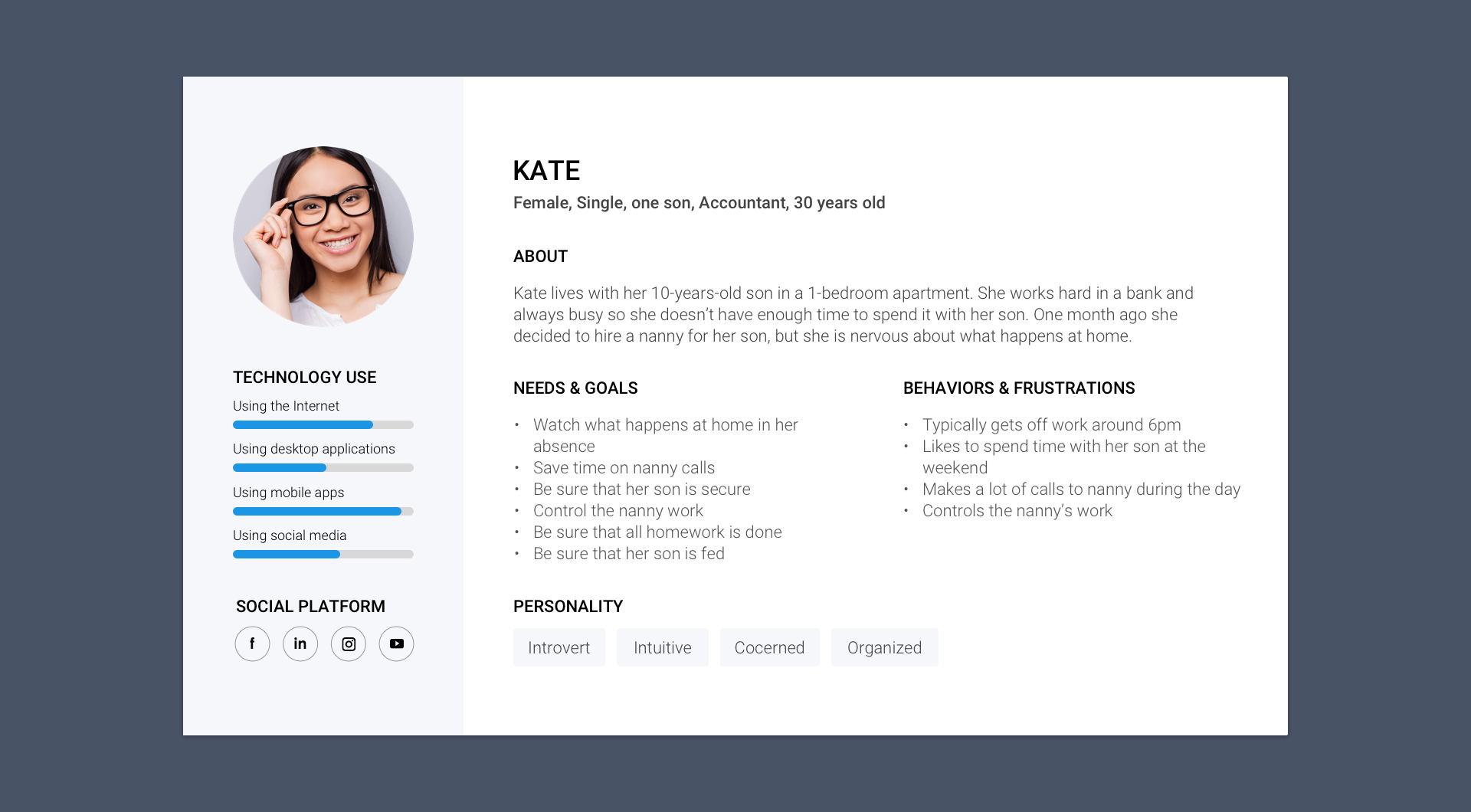
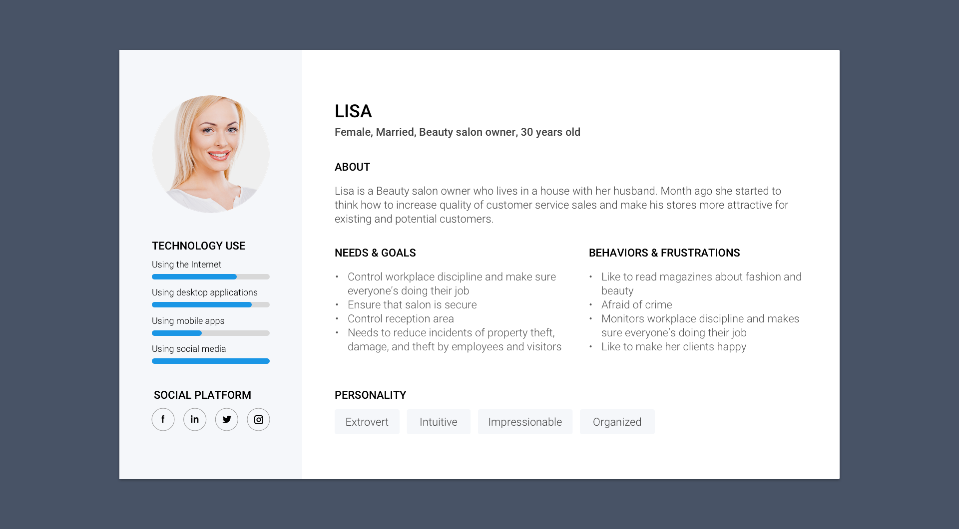
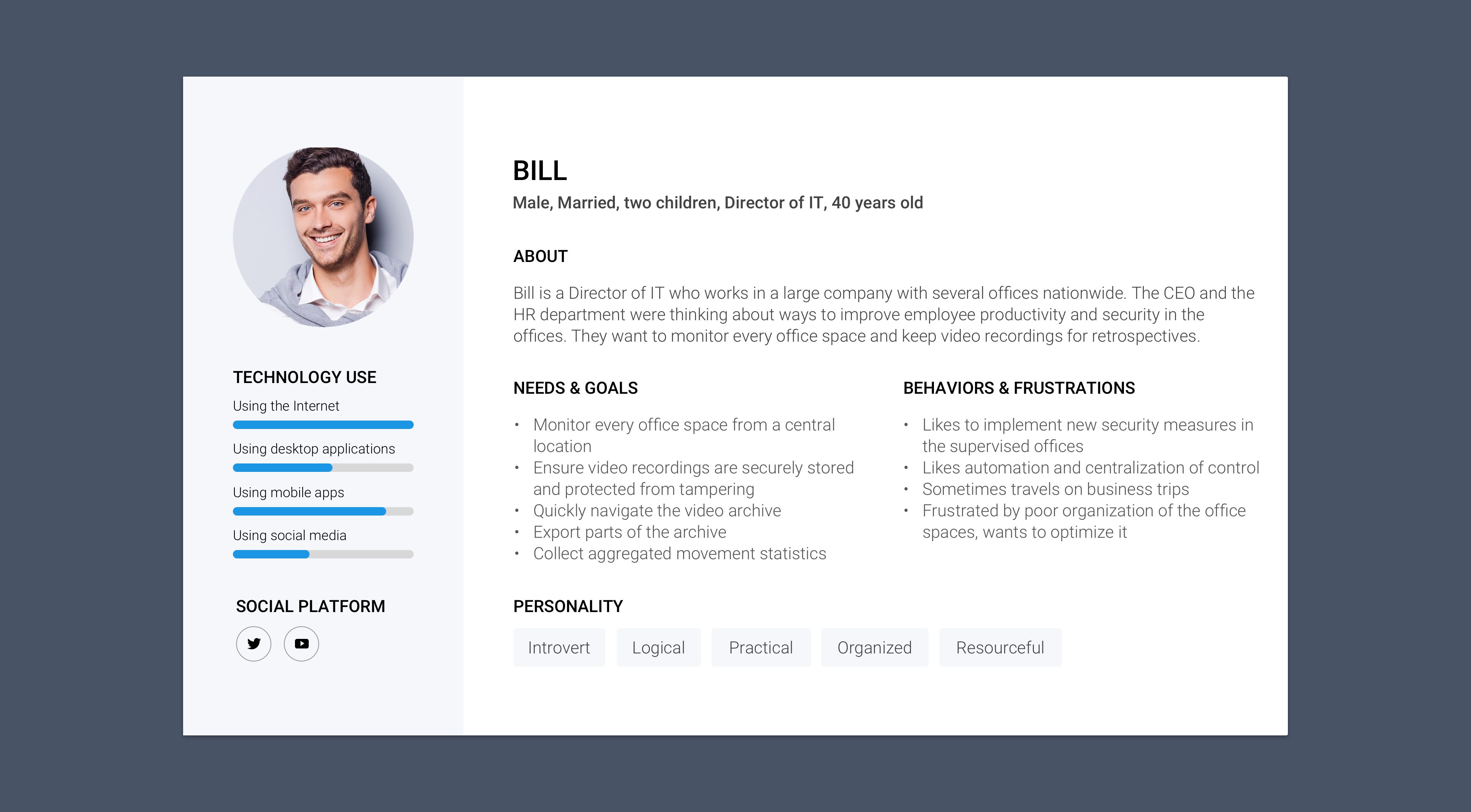
It has become clear to me that the existing look & feel did not fit well with the company goal to present the brand as mature, secure, and trustworthy for both business and home users. I suggested to perform a brand refresh to align the brand identity with the goal. At that time there already existed a lot of products which were used by a lot of customers, so the transition had to happen gradually over time and without major disruptions to the user experience. We decided to start with the company website which was mostly accessed by potential new customers, and continue with the web, mobile, and desktop applications for existing customers.
Over the course of a few years we performed two large iterations improving the brand identity and the UI design.
Design iteration 1
In the first iteration I upgraded the style to look more professional and mature:
• changed the brand color from very light blue with gradients to solid darker greyish blue to make it look more professional;
• changed the visuals of the logo and UI elements from plastic to flat to reduce the level of detail and make them look modern (we kept the logo shape the customers were familiar with to avoid the need for a massive rebranding campaign);
• replaced the cartoon illustrations throughout the website with photos, vector illustrations, and 3D-rendered objects;
• we decided to keep a slightly restyled cartoon illustration in one place on the front page to maintain continuity with the previous design.
Ivideon website circa 2014 with vector and 3D illustrations, photos
(the first iteration of the design improvement)
Design iteration 2
In the second iteration I made the style more fresh and clean:
• changed the brand color from dark greyish blue to sky blue to make it more appealing and memorable;
• inverted the logo (white logo on solid brand-color background instead of solid brand-color logo on white background);
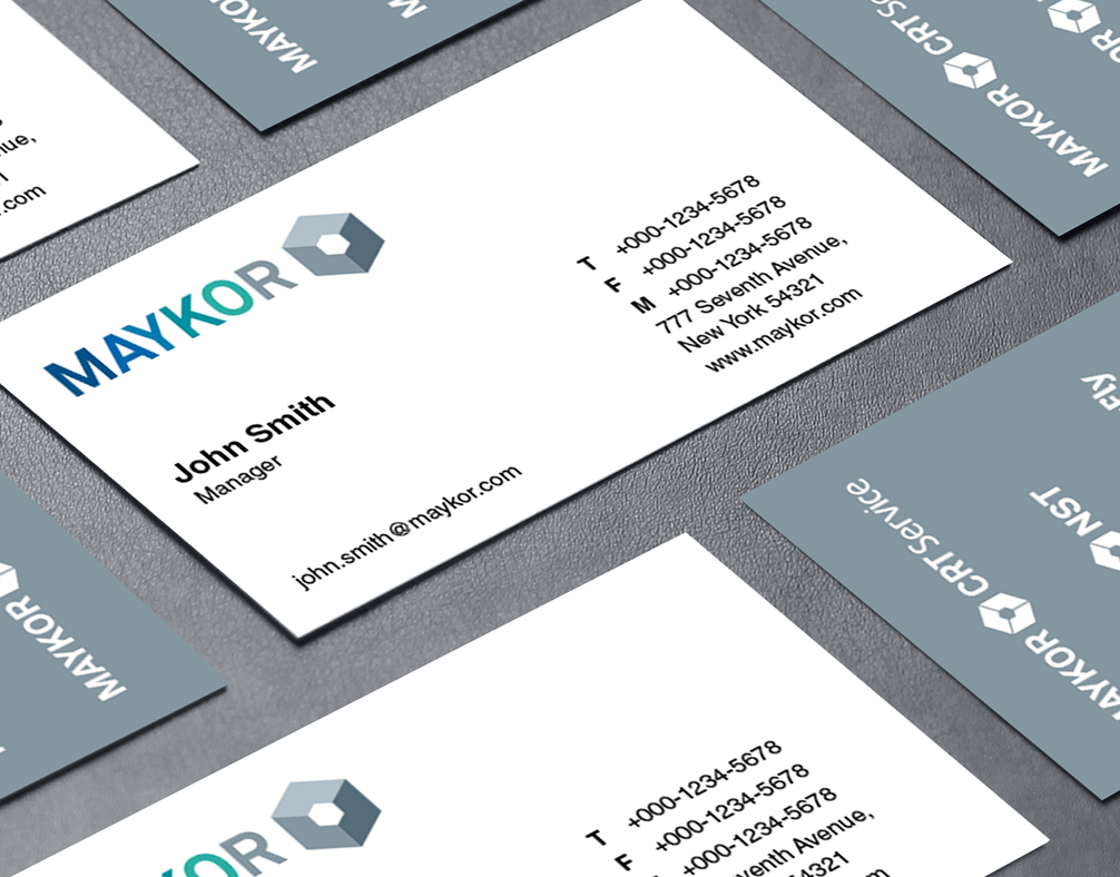
• replaced the cartoon illustrations with high-quality photos, removed the 3D-rendered objects, and upgraded the vector icons to the newly designed custom icon set (we decided to persist the legacy of the friendly cartoon characters in the stylized company business cards).
Ivideon website with high-quality photos and custom vector icons
(the second iteration of the design improvement)
Problem: users have different needs but they get the same information about features and pricing
Originally the website targeted all users equally and had to display the variety of options how the service can be used. During the second iteration we’ve made a hypothesis that the customer needs are so different that they get confused with the number of available options and perceive the service as complex to get started for their particular needs. I conducted an ideation session with the core stakeholders to brainstorm on the hypothesis, and worked on the overall structure, information architecture of the website, and the user flows.
Solution: develop two separate sections of the website for business and for home users
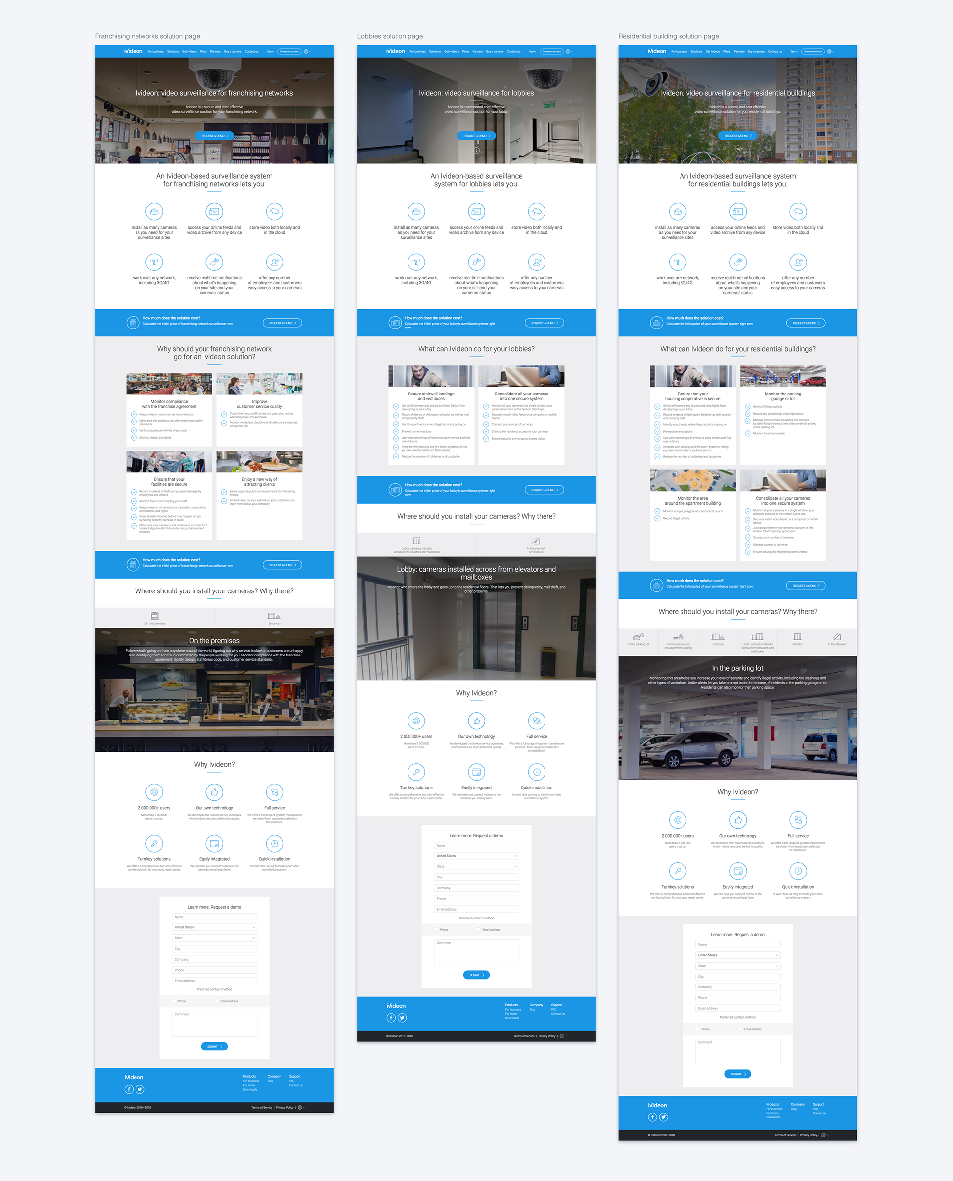
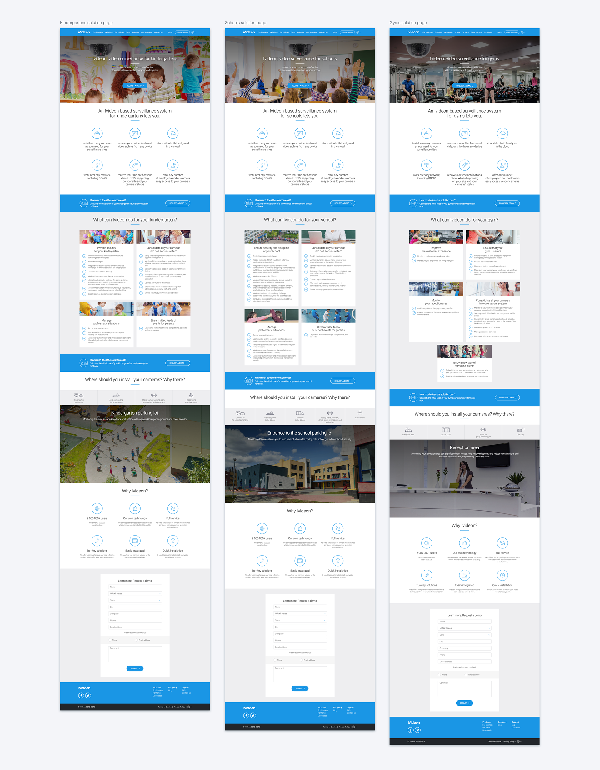
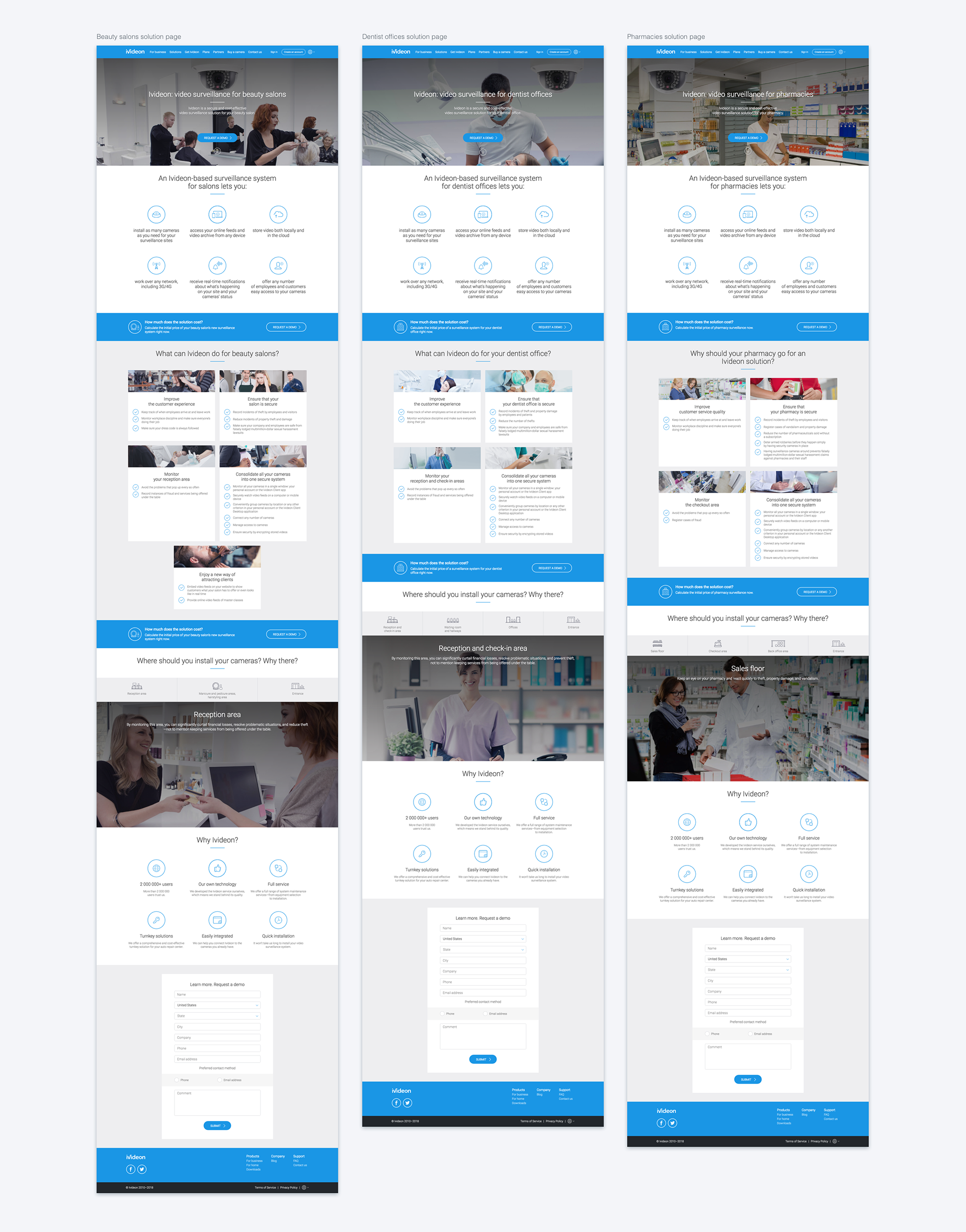
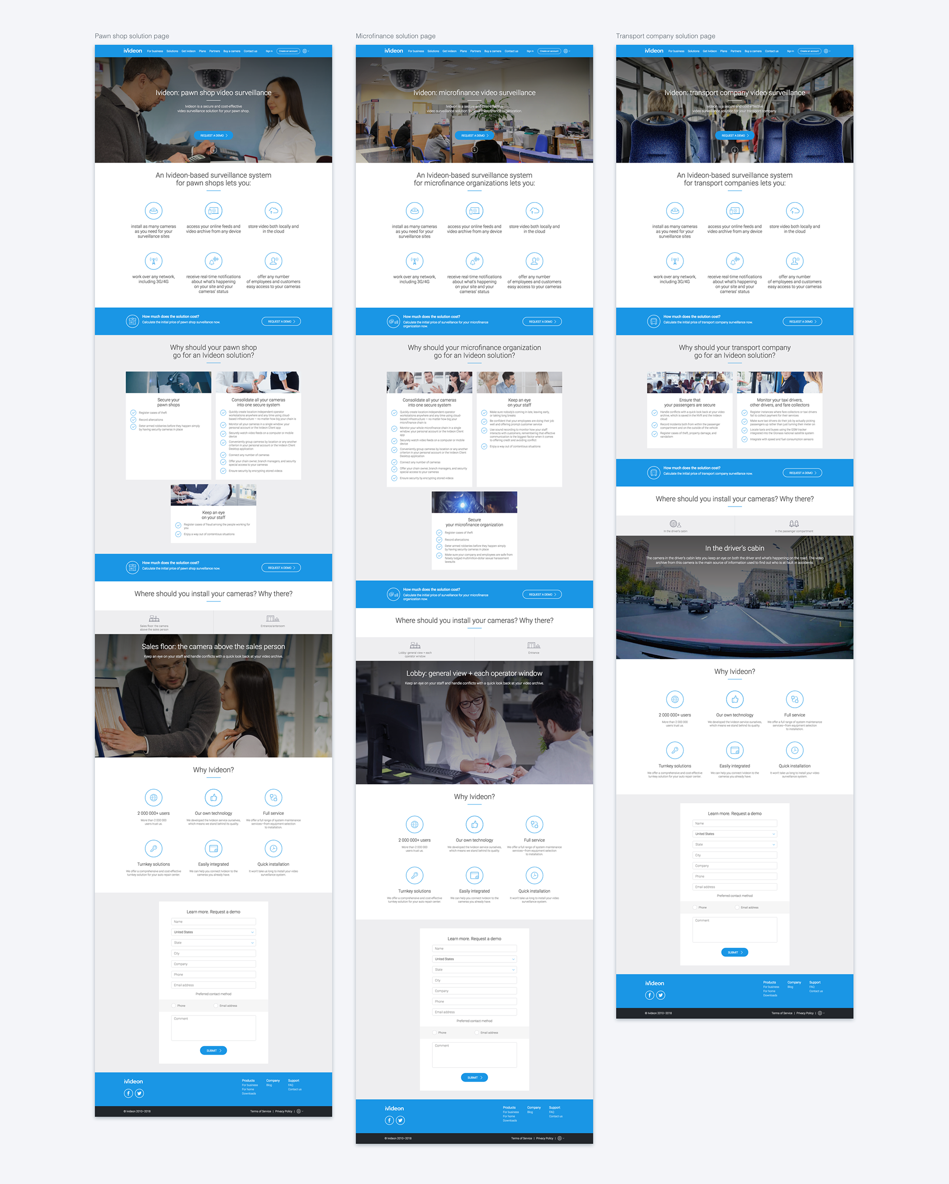
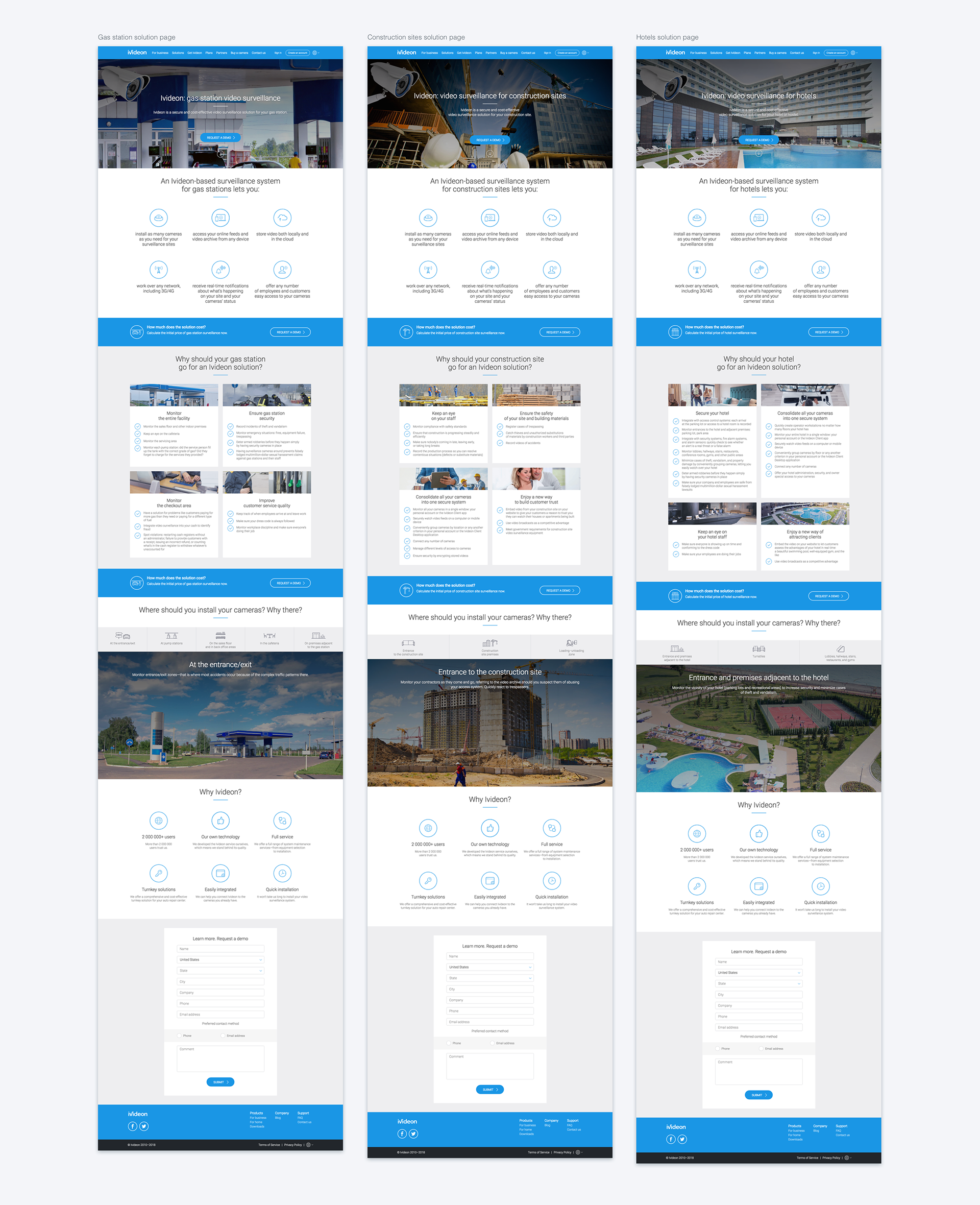
The decision was made to divide the potential customers into two categories (B2C and B2B) to guide them into two different sections of the website. Two separate pricing pages were prepared. User account types were introduced on signup to let the new users select what best suits them and later show them only a relevant subset of features and plans for their needs. The service features and the pricing plans were always different for individual customers and businesses, but we originally presented to them in a single lineup that was confusing for both categories.
We discussed and adapted the presentation of the service features separately for B2C and B2B users, determined which features are more appropriate to highlight and advertise to each category.
Information architecture
From drafts to high fidelity
I worked on the first drafts with pen and paper trying different layouts of the information on the pages. When there was enough exploration, I moved on to wireframes which later were translated into interactive prototypes that allowed me to simulate the interactions with the design. The prototypes helped me to identify basic usability issues before going forward.
I worked on the first drafts with pen and paper trying different layouts of the information on the pages. When there was enough exploration, I moved on to wireframes which later were translated into interactive prototypes that allowed me to simulate the interactions with the design. The prototypes helped me to identify basic usability issues before going forward.
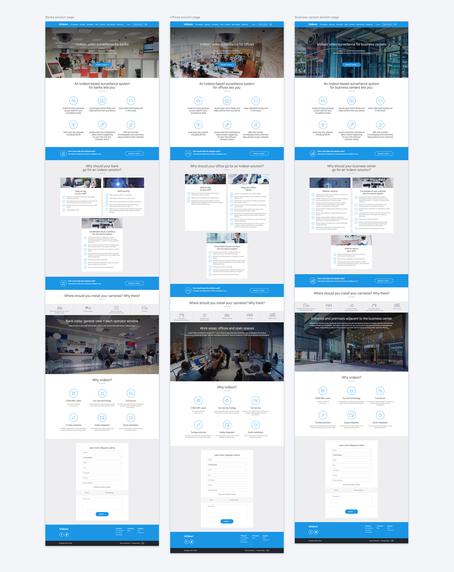
After having settled on the layouts, I designed the high-fidelity mockups for the website pages that we planned for the initial rollout of the new design. While working on the high-fidelity mockups, I established typography, common design patterns, and shared components to be reused across the website and later in the Ivideon Web Dashboard.
All these stages were regularly discussed with the team that included the business executives, product managers, engineers, and salespeople to determine constraints and resolve issues early in the process.
NEXT STEPS
The work on the website continued after the brand refresh to upgrade the pages and sections that we omitted from the initial rollout, such as the Blog and the Customer Support forum. This project kicked off a series of UI and UX improvement initiatives, including the Ivideon Web Dashboard upgrade, visual refresh of Ivideon Mobile and Desktop Apps, customization of embedded UIs of the Ivideon-powered cameras, and more (described separately).
The work on the website continued after the brand refresh to upgrade the pages and sections that we omitted from the initial rollout, such as the Blog and the Customer Support forum. This project kicked off a series of UI and UX improvement initiatives, including the Ivideon Web Dashboard upgrade, visual refresh of Ivideon Mobile and Desktop Apps, customization of embedded UIs of the Ivideon-powered cameras, and more (described separately).
FINAL DESIGNS


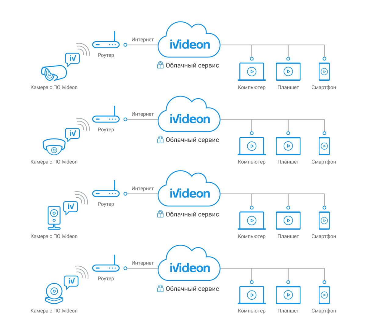
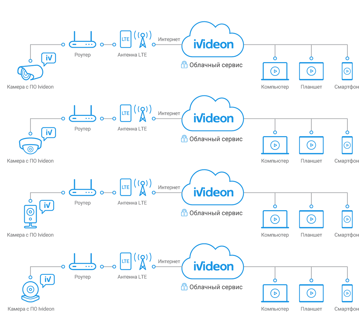
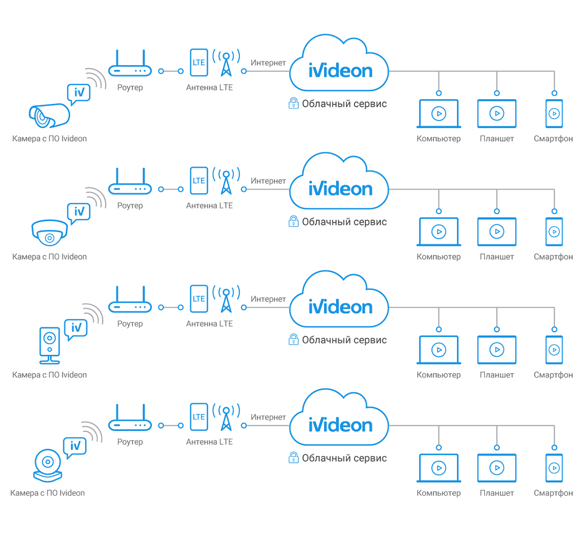
Different ways to connect cameras to Ivideon
