MY ROLE
Principal product designer. Research, wireframing, prototyping, UI design, icons and illustrations, visual design, branding design.
Principal product designer. Research, wireframing, prototyping, UI design, icons and illustrations, visual design, branding design.
TOOLS
Sketch App, Adobe Illustrator, Adobe Photoshop, Jira, Confluence.
Sketch App, Adobe Illustrator, Adobe Photoshop, Jira, Confluence.
INTRO
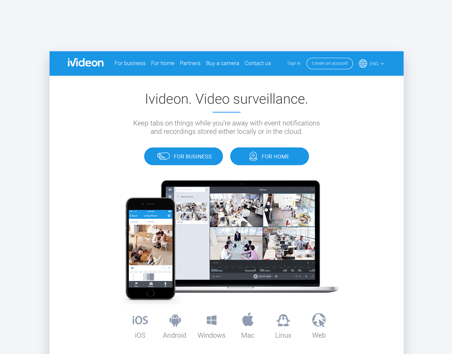
Ivideon is a global cloud video surveillance service with more than 3.5 million of active users and more than 900 business partners around the world. Ivideon users can open the connected cameras to the public to share fascinating live video feeds with people around the globe for advertisement and educational purposes.
Ivideon is a global cloud video surveillance service with more than 3.5 million of active users and more than 900 business partners around the world. Ivideon users can open the connected cameras to the public to share fascinating live video feeds with people around the globe for advertisement and educational purposes.
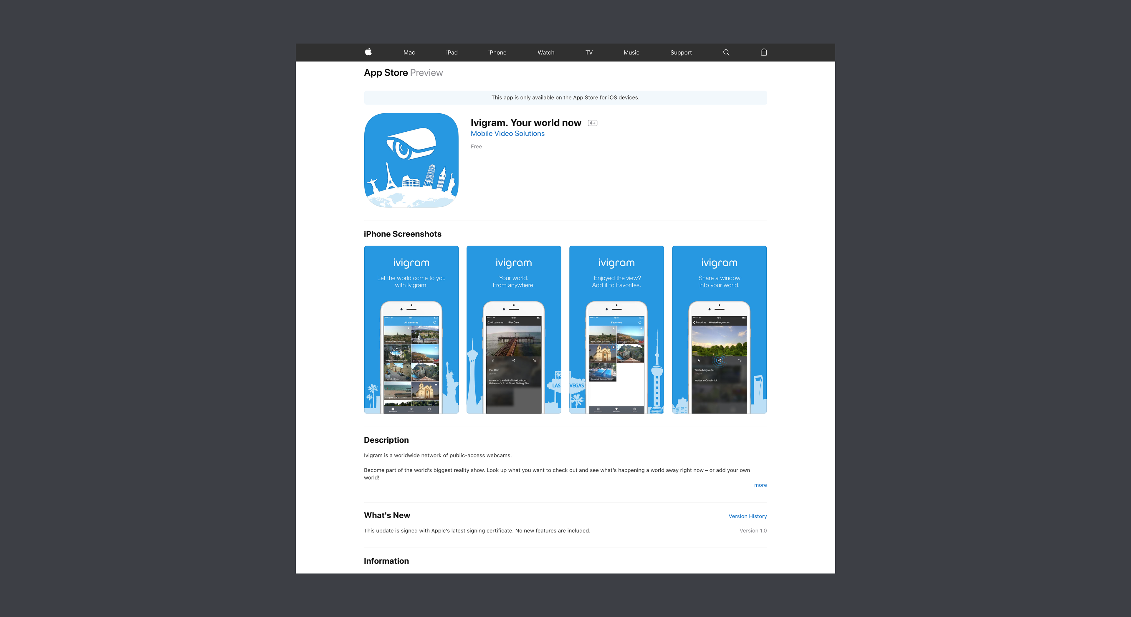
Ivigram is a mobile app for anyone to watch the cameras that Ivideon users opened to the public.
GOAL
Design a mobile app that shows live video feeds from public cameras connected to Ivideon and encourages viewers to join Ivideon and use its services.
Design a mobile app that shows live video feeds from public cameras connected to Ivideon and encourages viewers to join Ivideon and use its services.
CHALLENGE
Find a way to promote buying a connected camera and using the Ivideon services.
Find a way to promote buying a connected camera and using the Ivideon services.
RESULTS
• I designed both the MVP and the nice-to-have features of the Ivigram mobile app and got approval from the product manager and from the lead mobile app engineer.
• The mobile app engineers implemented and published the MVP version to the App Store, but postponed the implementation of the nice-to-have features to the next iterations of development due to change of priorities.
• The number of downloads has gone up to about 1000 per month.
• The number of visits to the camera landing pages increased by 8% as new users started using Ivigram and tapping the promo blocks.
• We received some feedback from the users. The majority requested to add a map.
DESIGN PROCESS
Competitor analysis
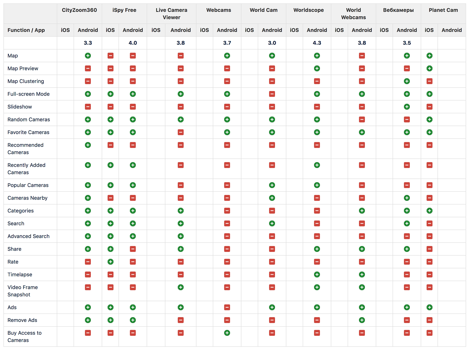
As I designed this mobile app from scratch, I started with extensive analysis of similar apps in the mobile app stores. I chose the 9 most popular mobile apps for iOS and Android and compared them by 21 features that I found across all apps.
Competitor analysis
As I designed this mobile app from scratch, I started with extensive analysis of similar apps in the mobile app stores. I chose the 9 most popular mobile apps for iOS and Android and compared them by 21 features that I found across all apps.
At the time of this project, the public cameras could also be viewed via a web application called “Ivideon TV”. I omitted “Ivideon TV” from the feature comparison, but I kept its features in mind as its backend was planned to be reused to power the mobile app features.
After the result of the analysis has been presented to the product team, a set of MVP and nice-to-have features was composed. The MVP features included:
• the list of online cameras with interleaved promotional blocks;
• the live video player;
• social network sharing;
• the list of favorite (bookmarked) cameras;
• the “about app” screen.
• the live video player;
• social network sharing;
• the list of favorite (bookmarked) cameras;
• the “about app” screen.
The nice-to-have features were:
• the map;
• the search.
• the search.
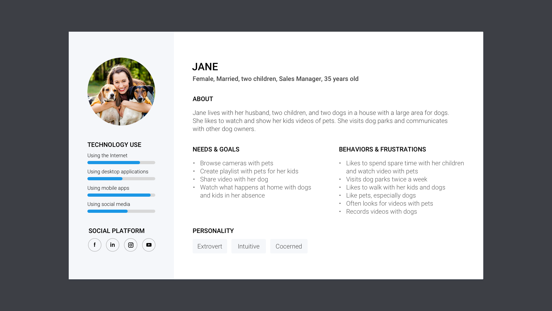
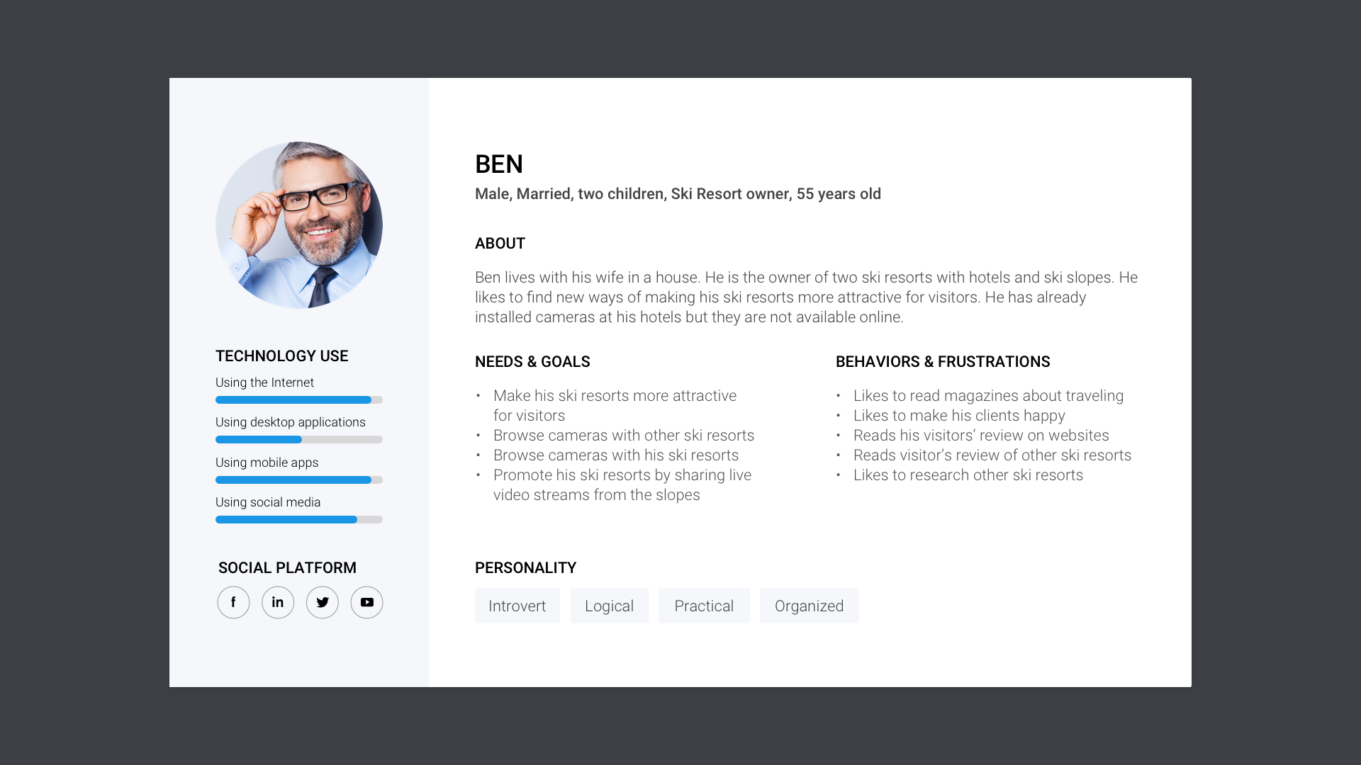
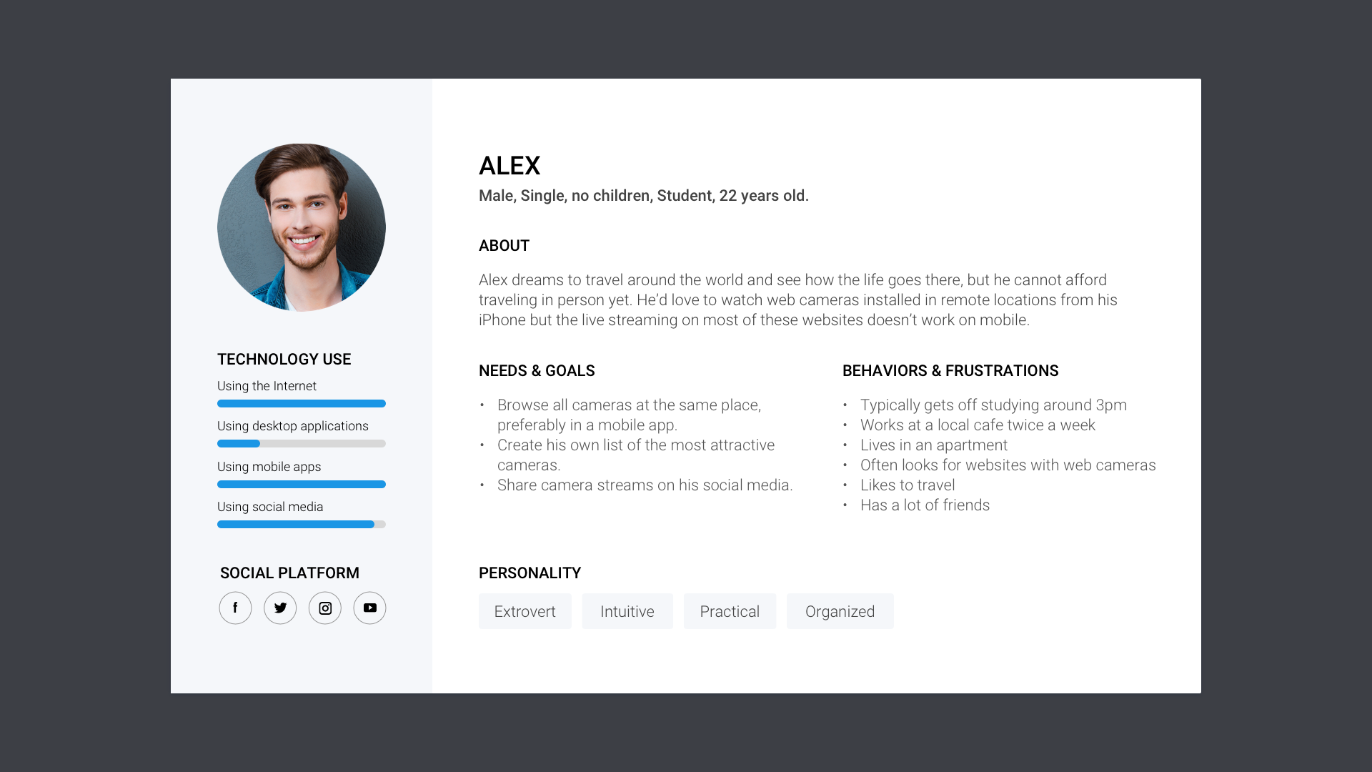
Ivigram personas
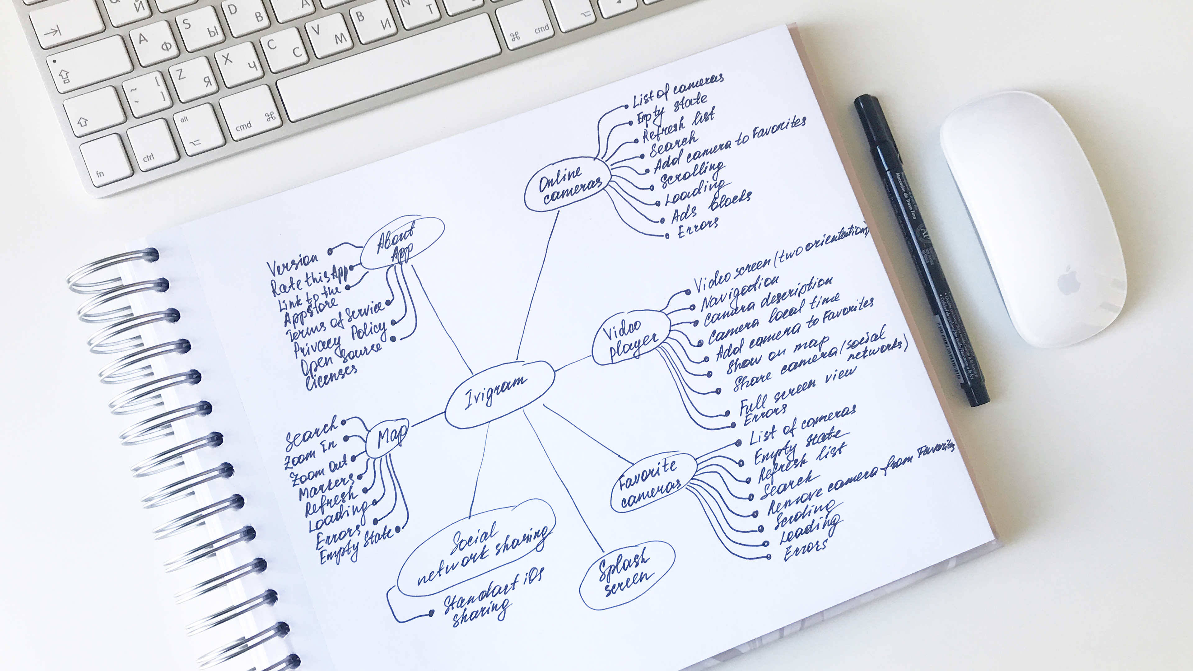
Ivigram mindmap
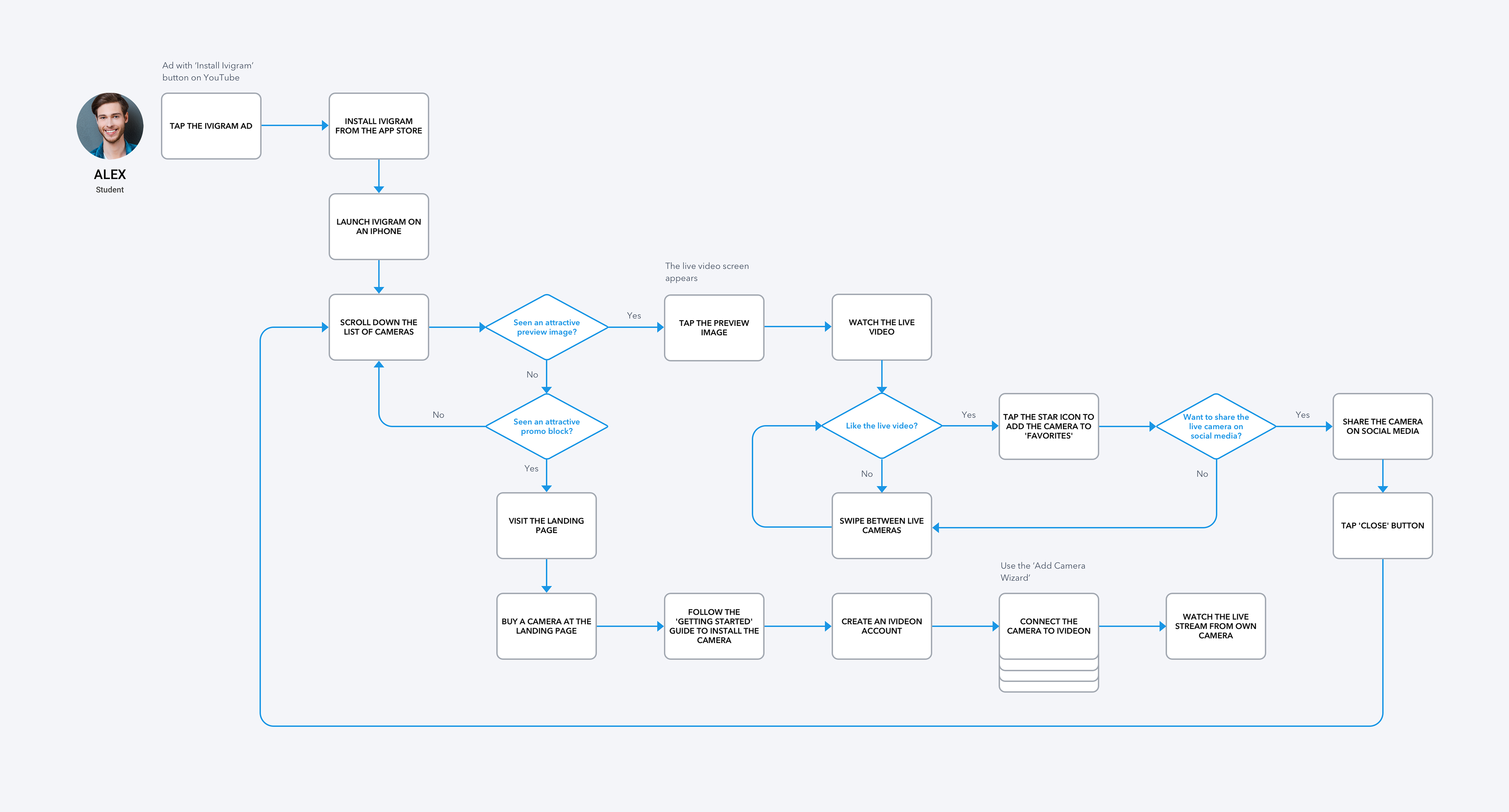
User journey
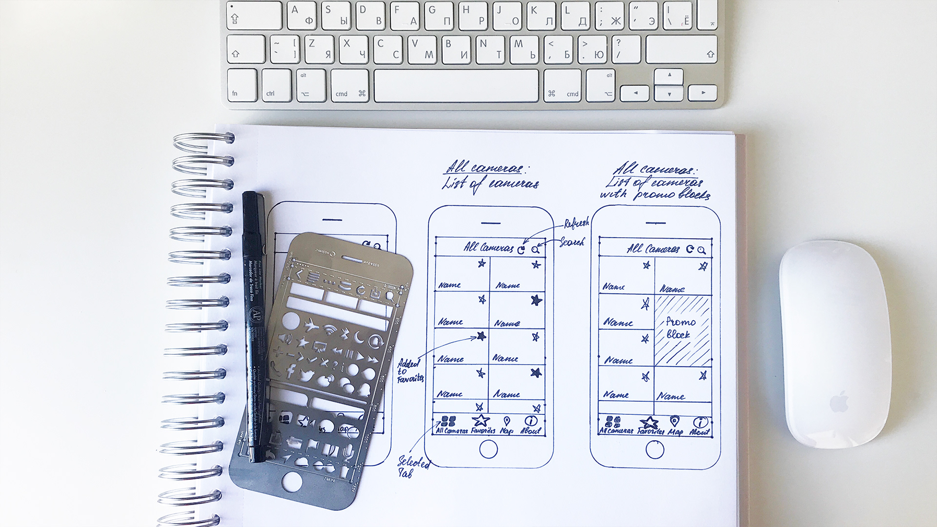
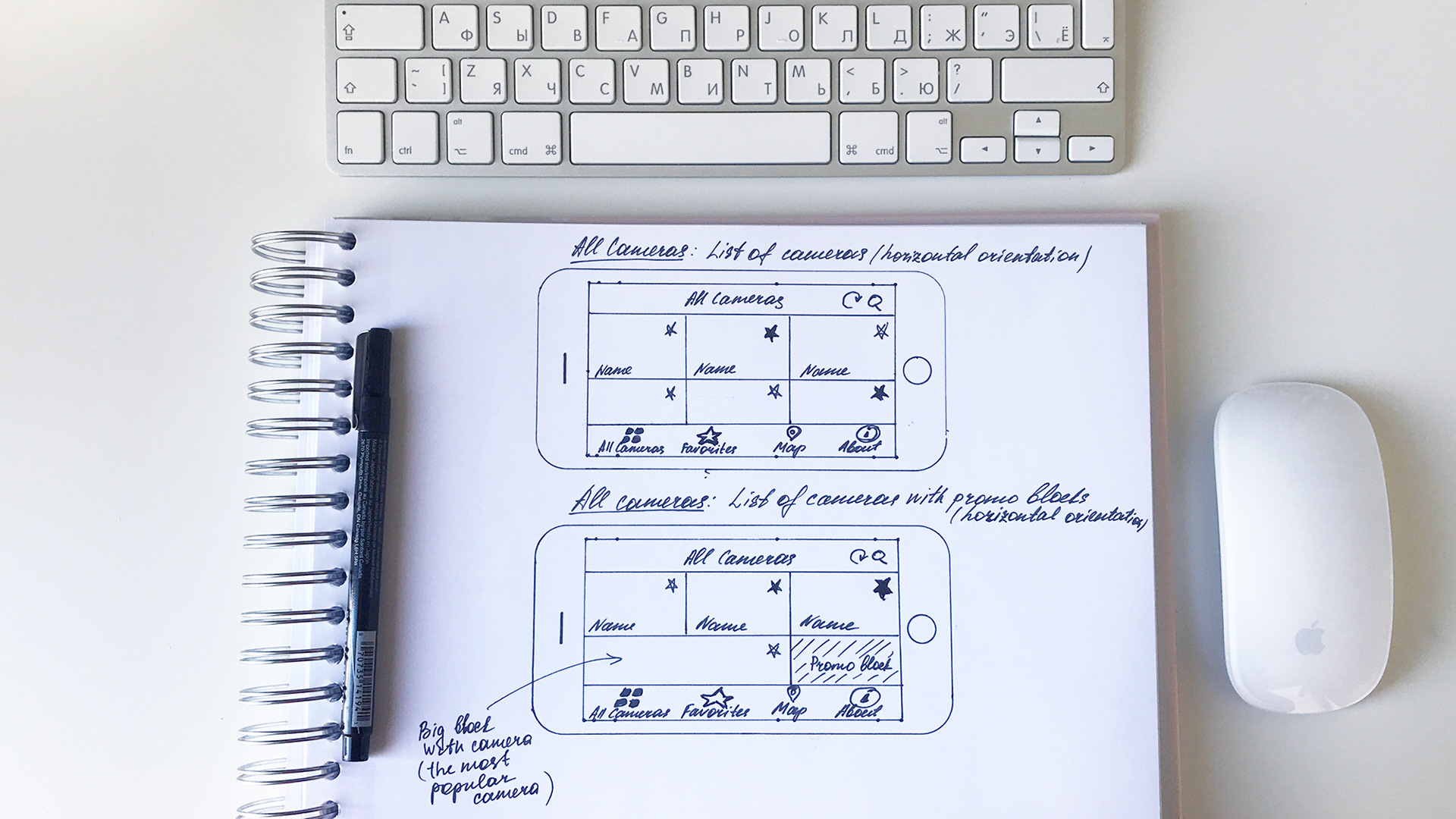
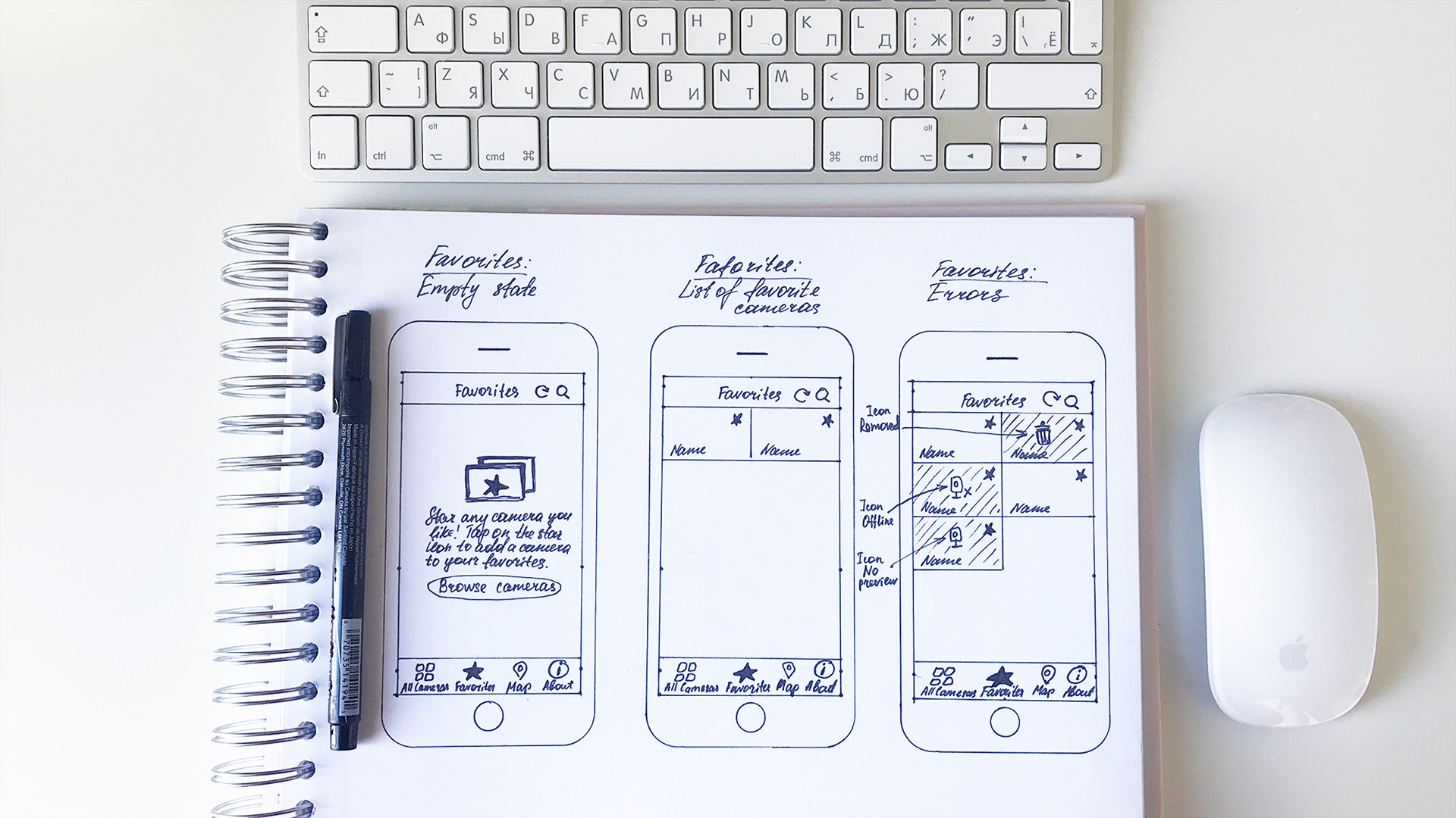
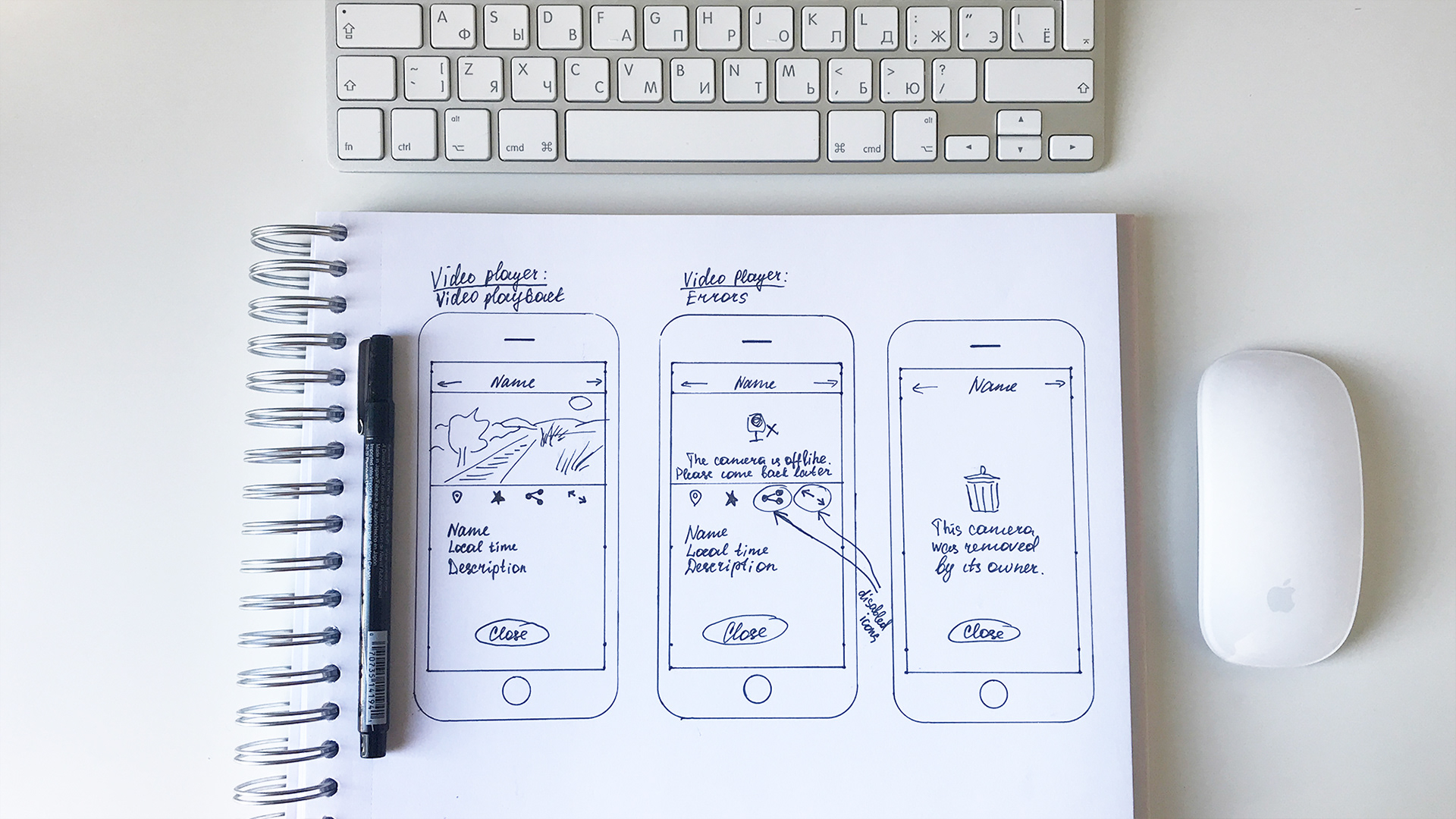
Hand-drawn wireframes
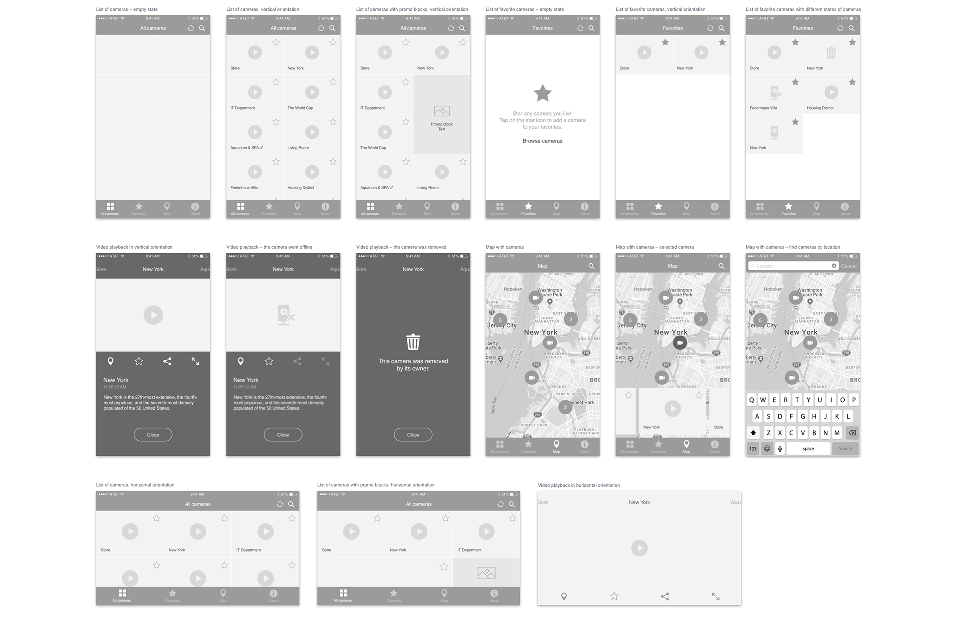
High-fidelity wireframes
FINAL DESIGNS
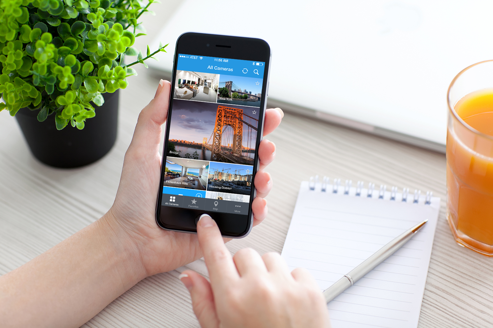
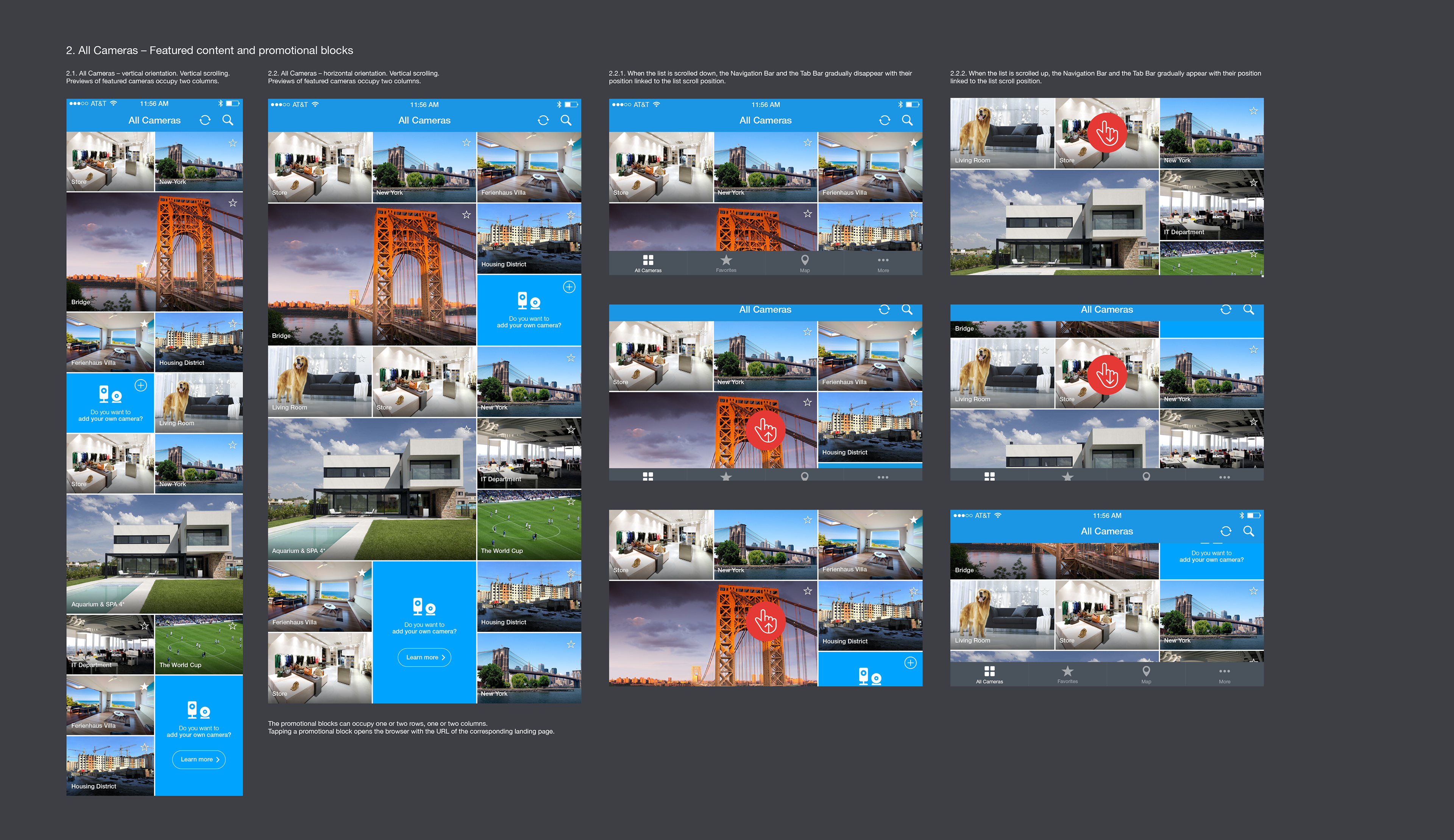
All Cameras – Portrait and landscape layout
In contrast to most desktop-size apps, mobile apps are used in two orientations, so the layouts needed to account for that. The images from the users’ cameras are constrained to a certain aspect ratio, and often weren’t displaying the best image quality, so we could not expand them to the full width of the screen. I made the camera list layout into two columns instead of one for the vertical orientation to compensate for the image quality, and into three columns for the horizontal orientation to account for the aspect ratio and have more than one row of images on screen at a time.
In contrast to most desktop-size apps, mobile apps are used in two orientations, so the layouts needed to account for that. The images from the users’ cameras are constrained to a certain aspect ratio, and often weren’t displaying the best image quality, so we could not expand them to the full width of the screen. I made the camera list layout into two columns instead of one for the vertical orientation to compensate for the image quality, and into three columns for the horizontal orientation to account for the aspect ratio and have more than one row of images on screen at a time.

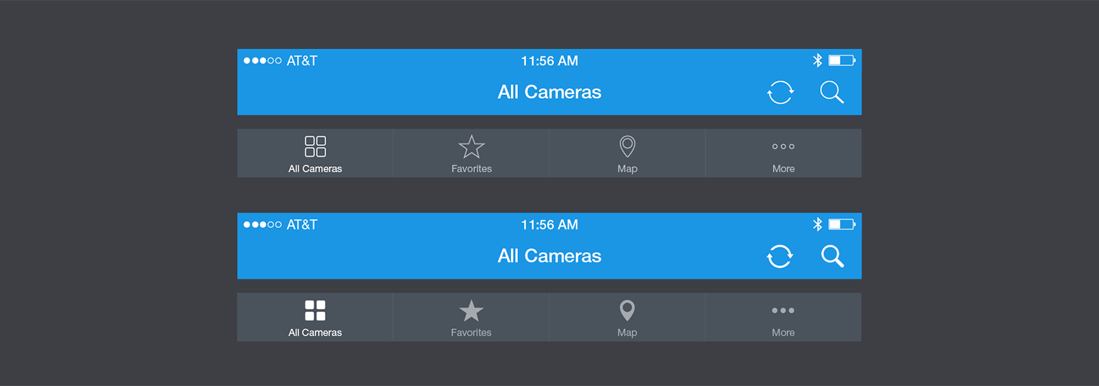
App-wide navigation
The common app screen navigation was designed to be present on screen most of the times. I designed custom icons for it based on the brand icon set I designed earlier for the Ivideon line of products. I created two variants of the navigation and tab bars: with contour icons and with solid icons. Finally, we decided to use the higher contrast solid icons.
The common app screen navigation was designed to be present on screen most of the times. I designed custom icons for it based on the brand icon set I designed earlier for the Ivideon line of products. I created two variants of the navigation and tab bars: with contour icons and with solid icons. Finally, we decided to use the higher contrast solid icons.
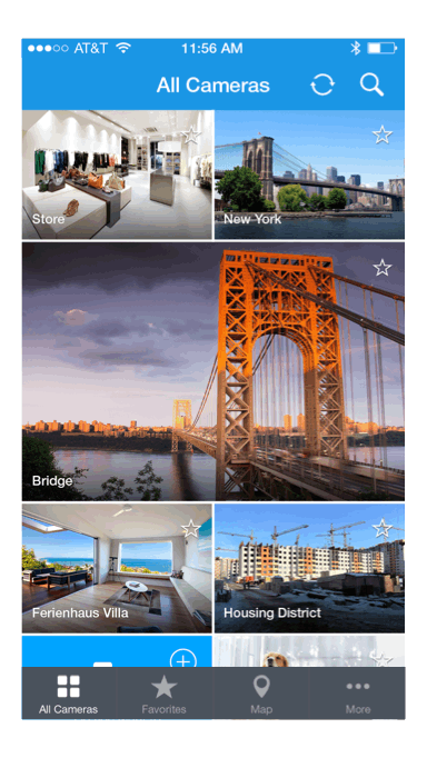
All Cameras – Featured content, promotional blocks
The camera list was meant to be the most visited screen. It was intentionally not graphic-rich to make the live video previews and the promotional blocks the main attraction. Each preview had to have an inline control to add/remove from Favorites so that the user can bookmark some cameras while scrolling to come back to watch them later.
The camera list was meant to be the most visited screen. It was intentionally not graphic-rich to make the live video previews and the promotional blocks the main attraction. Each preview had to have an inline control to add/remove from Favorites so that the user can bookmark some cameras while scrolling to come back to watch them later.
All Cameras – Scrolling behavior
For a mobile app that is targeted to a broad audience it’s important to make sure the interactions are intuitive. The list loading top-to-bottom animation gives a hint that the list is infinite at the bottom. As the natural behavior for an infinite list is to scroll down, the navigation bars were designed to move away to display more content while scrolling down, and to move back in while scrolling up.
For a mobile app that is targeted to a broad audience it’s important to make sure the interactions are intuitive. The list loading top-to-bottom animation gives a hint that the list is infinite at the bottom. As the natural behavior for an infinite list is to scroll down, the navigation bars were designed to move away to display more content while scrolling down, and to move back in while scrolling up.
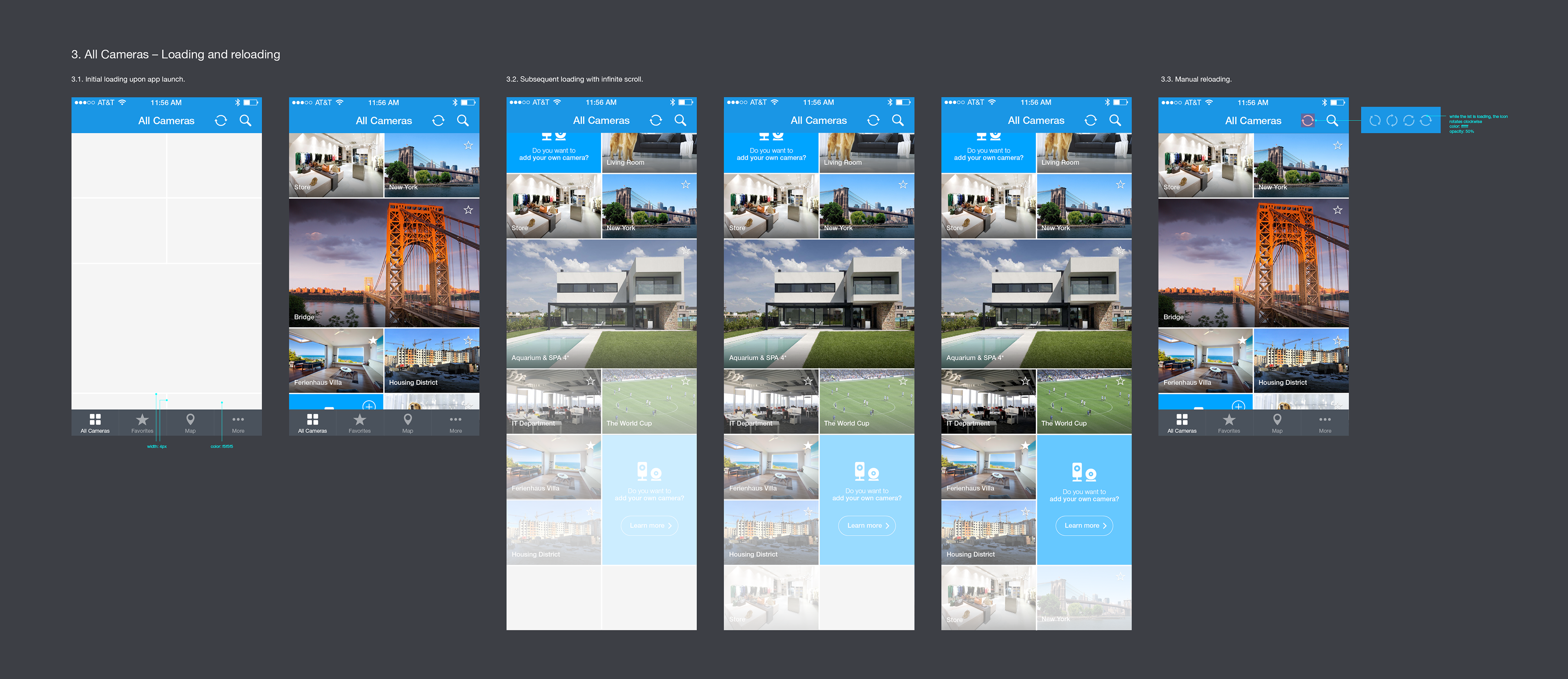
All Cameras – Loading and reloading
Technical specifics of the backend that provides access to the camera lists, preview images, and live video streams, needed to be taken into account. Loading times of the live preview images were not instantaneous and not consistent due to cache misses and variable latency in camera responses. This affected the way the list previews were designed to show up while scrolling to make the experience as smooth as possible.
Technical specifics of the backend that provides access to the camera lists, preview images, and live video streams, needed to be taken into account. Loading times of the live preview images were not instantaneous and not consistent due to cache misses and variable latency in camera responses. This affected the way the list previews were designed to show up while scrolling to make the experience as smooth as possible.

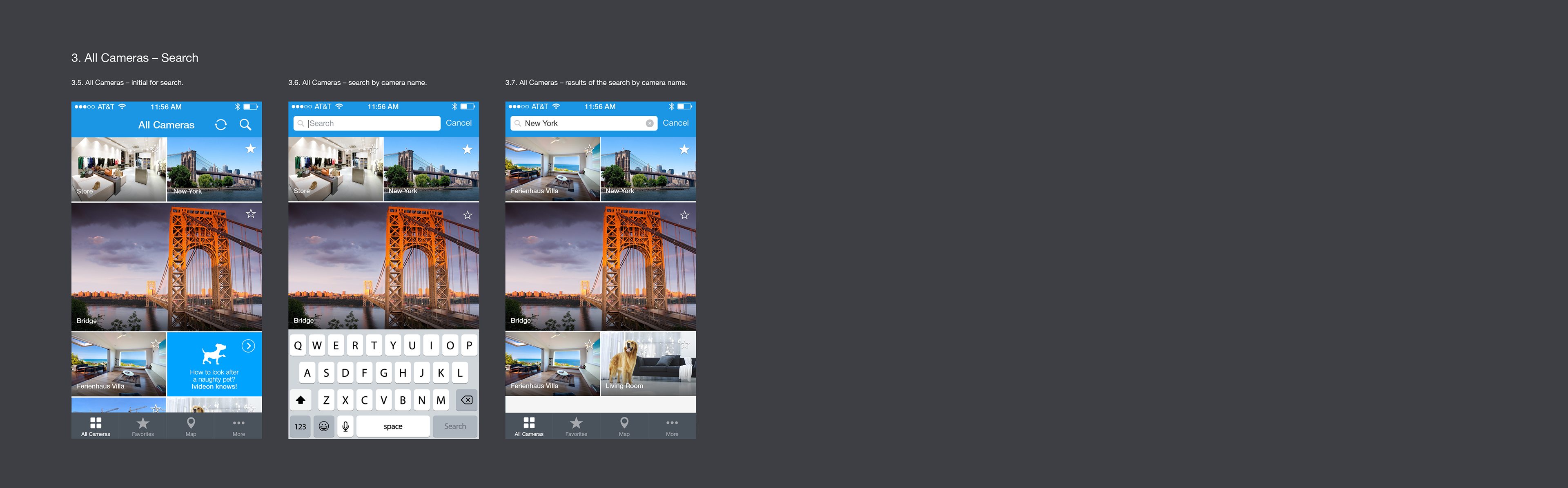
All Cameras – Search
The search feature was a nice-to-have, but it was one of the features present in many competitor apps, so there had to be a good place reserved for it in the UI design.
The search feature was a nice-to-have, but it was one of the features present in many competitor apps, so there had to be a good place reserved for it in the UI design.
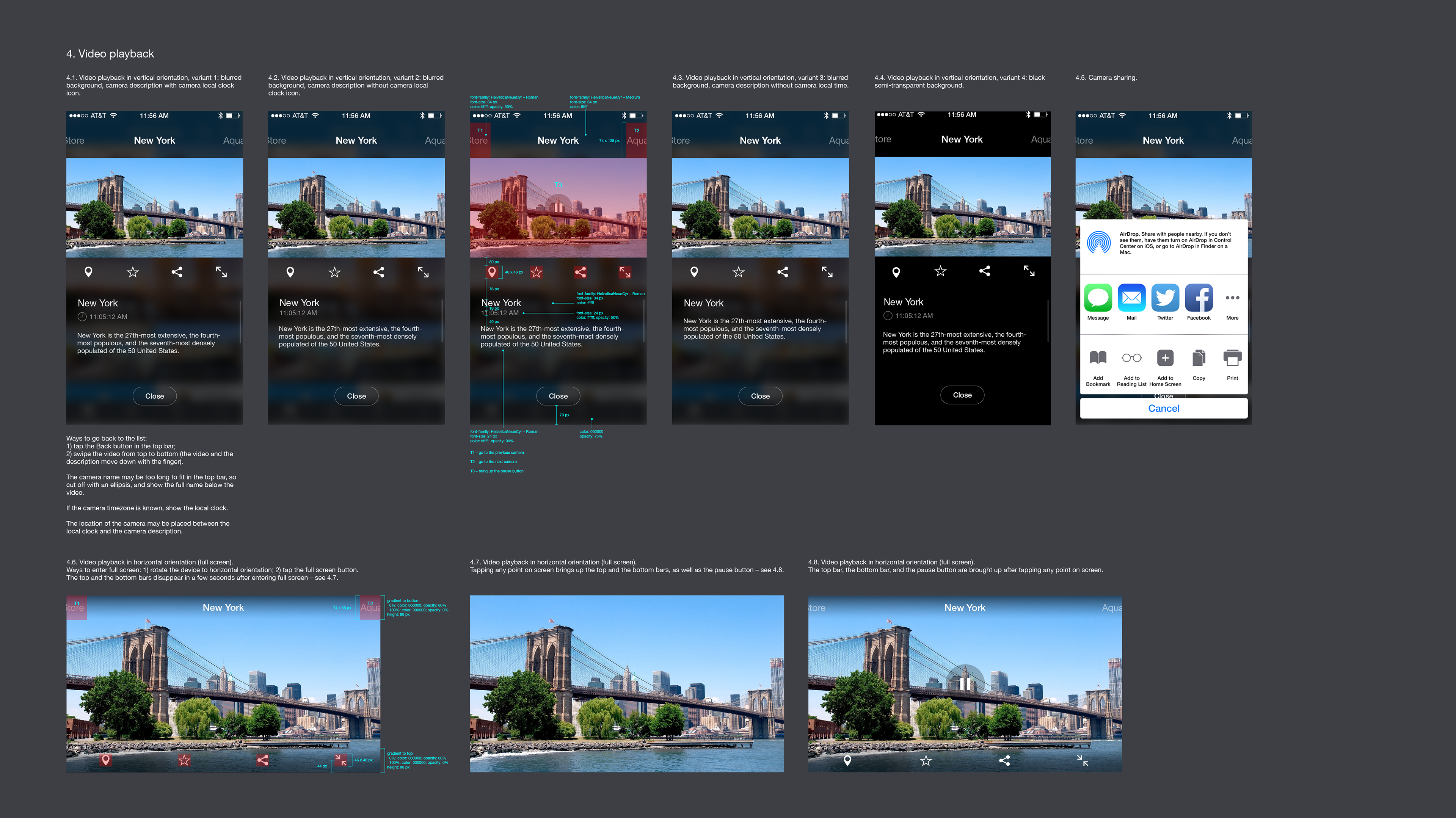
Video playback
The live video player screen was meant to be the second most visited screen, so it had to be nice-looking but not distracting from the video. I designed multiple background and camera information styles of different implementation complexity for the mobile app engineers to choose based on how much time they would have to implement this screen.
The live video player screen was meant to be the second most visited screen, so it had to be nice-looking but not distracting from the video. I designed multiple background and camera information styles of different implementation complexity for the mobile app engineers to choose based on how much time they would have to implement this screen.
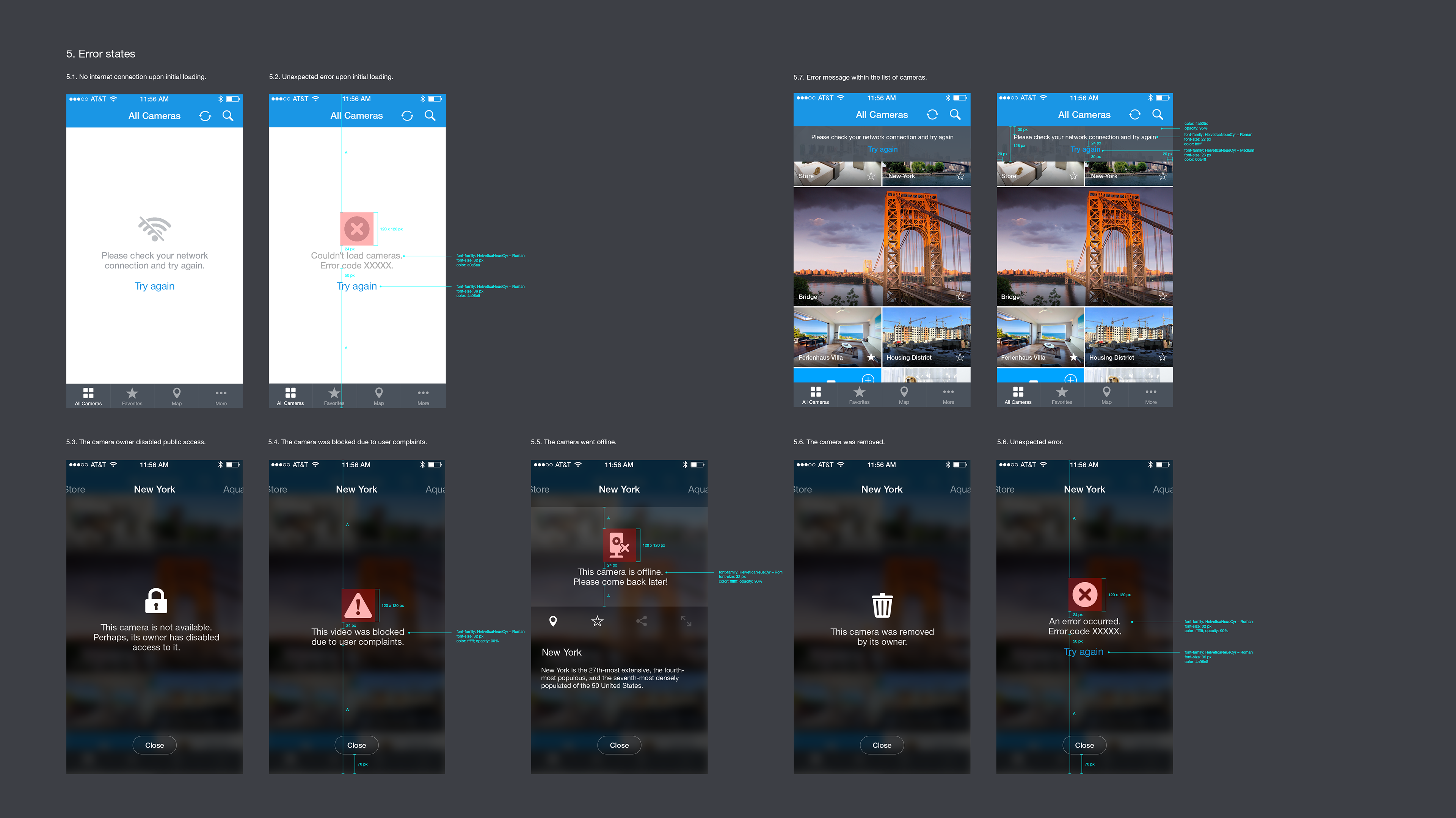
Error states
While viewers browse the list, cameras could go offline, public access could be revoked, or they could be taken down due to complaints. This required designing screens for different error states, and these had to be well-made to keep the viewers engaged.
While viewers browse the list, cameras could go offline, public access could be revoked, or they could be taken down due to complaints. This required designing screens for different error states, and these had to be well-made to keep the viewers engaged.
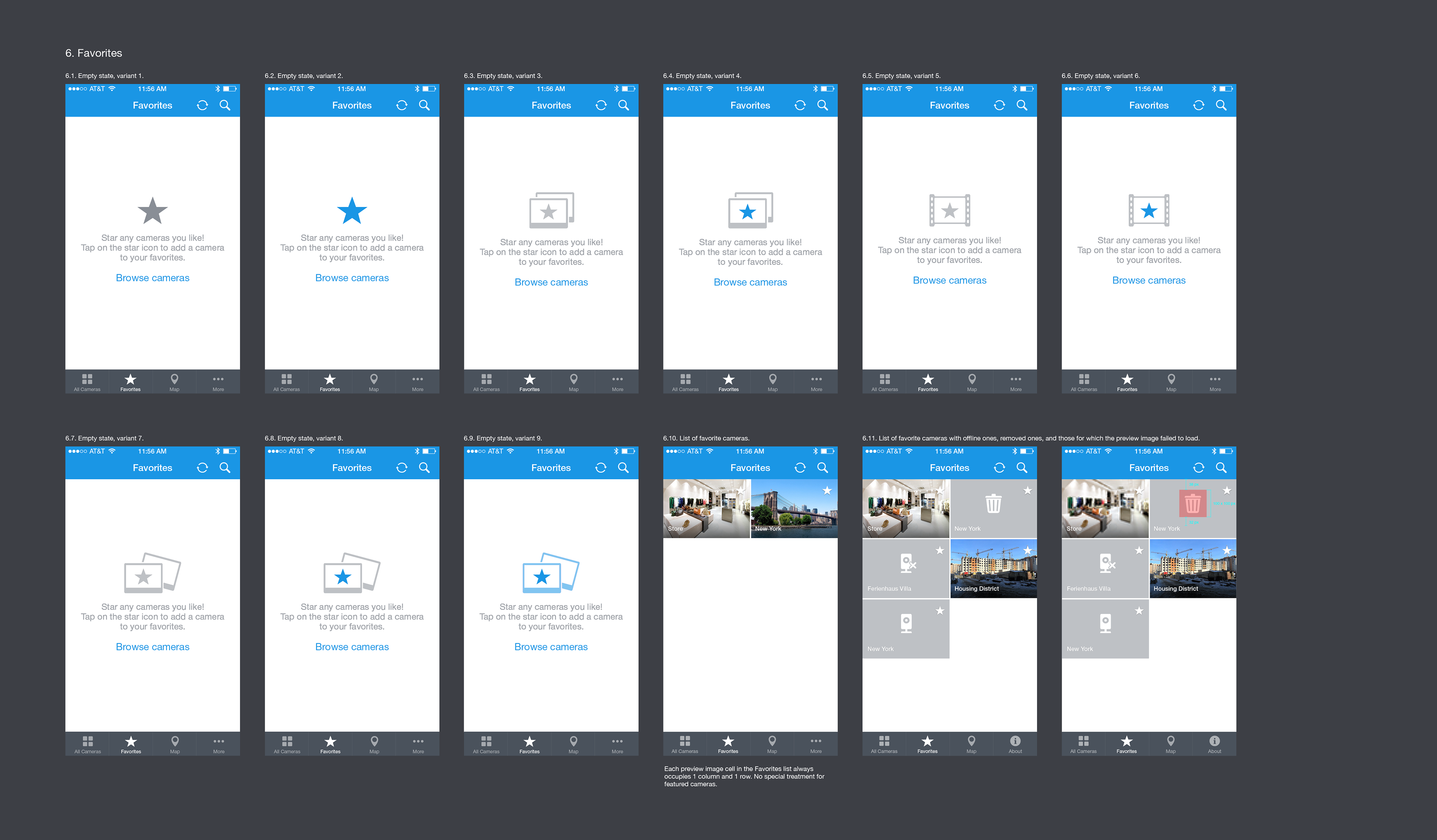
Favorites
The users were expected to have no favorites when they visit the favorites screen for the first time, so I designed several nice-looking and easy-to-implement empty states for it so that we could A/B-test which one better helps the users to add their first favorite camera. With availability of the cameras changing over time, it was also important to design how would the bookmarked cameras look if they are no longer available.
The users were expected to have no favorites when they visit the favorites screen for the first time, so I designed several nice-looking and easy-to-implement empty states for it so that we could A/B-test which one better helps the users to add their first favorite camera. With availability of the cameras changing over time, it was also important to design how would the bookmarked cameras look if they are no longer available.
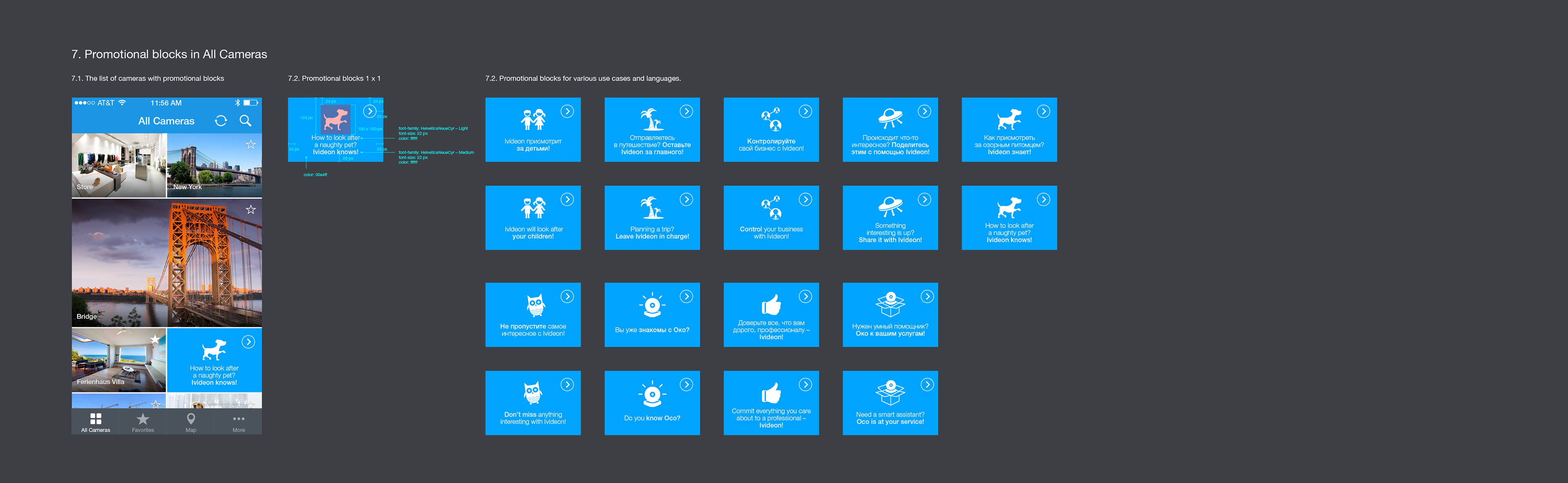
Promotional blocks
The promotional blocks had to stand out among the live video previews, so they were intentionally made vivid, high-contrast, and minimalistic (an eye-catching icon, a short caption, and a call-to-action button-like shape to provoke tapping).
The promotional blocks had to stand out among the live video previews, so they were intentionally made vivid, high-contrast, and minimalistic (an eye-catching icon, a short caption, and a call-to-action button-like shape to provoke tapping).
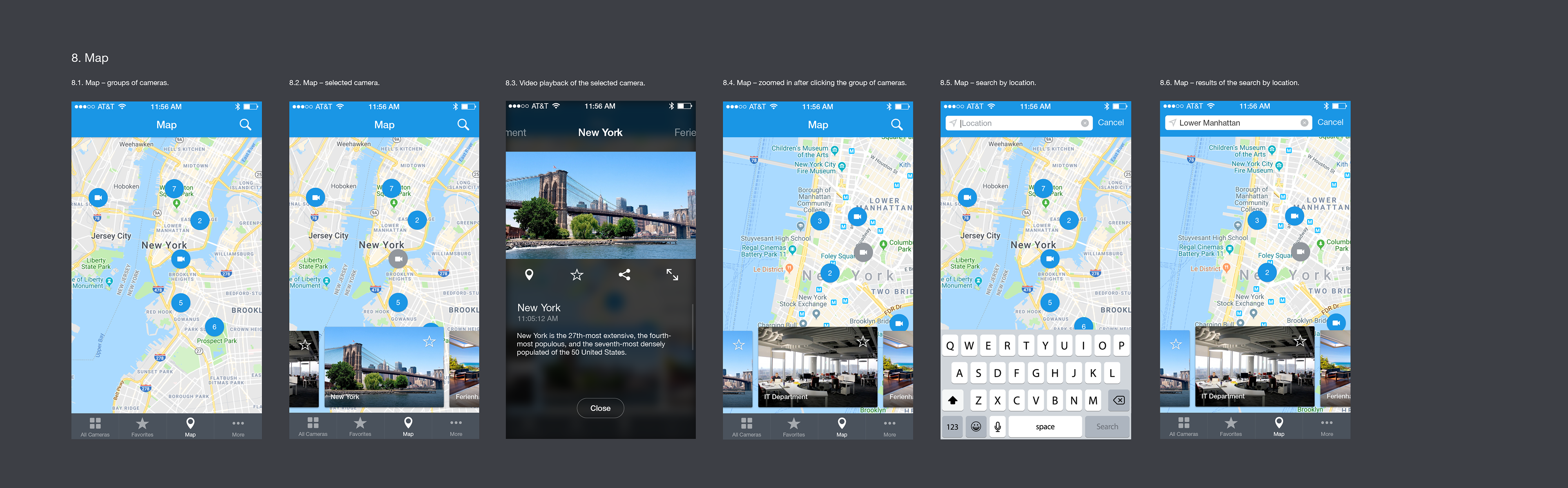
Map and search by location
The map feature was a nice-to-have, but it was one of the features present in many competitor apps, so there had to be a good place reserved for it in the UI design.
The map feature was a nice-to-have, but it was one of the features present in many competitor apps, so there had to be a good place reserved for it in the UI design.
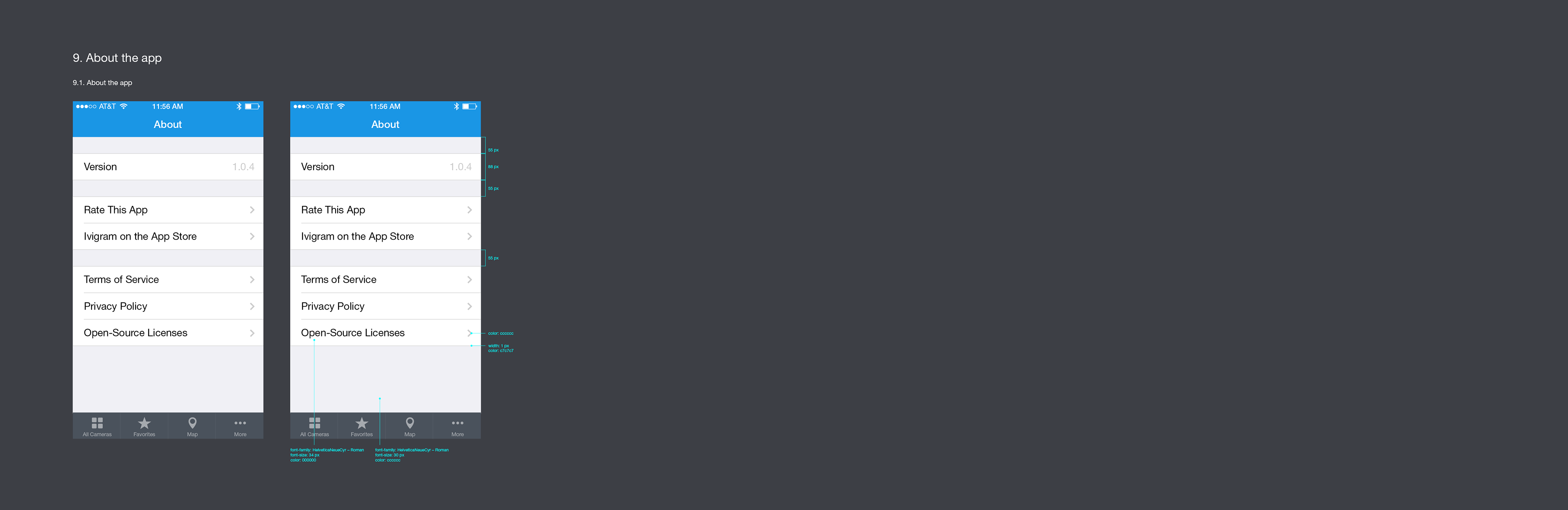
About the app
Testing and design tweaks
In the first version of the camera list the "Add to favorites" star icon was placed in the bottom right corner, on the same line with the camera name. As we started testing the prototypes with the actual data, we discovered that some of the camera names that the users provided were longer than we expected, so they did not fit.
In the first version of the camera list the "Add to favorites" star icon was placed in the bottom right corner, on the same line with the camera name. As we started testing the prototypes with the actual data, we discovered that some of the camera names that the users provided were longer than we expected, so they did not fit.

In the second version of the camera list the "Add to favorites" star icon was moved to the top right corner. The camera name got some space for a few extra characters. The "Add to favorites" function did not become less reachable because the list is can be scrolled back a little to reach and tap the icon.

Splash screen
The app had to have a splash screen because the initial list of cameras was slow to load, so I made a custom design to make the app more memorable.
The app had to have a splash screen because the initial list of cameras was slow to load, so I made a custom design to make the app more memorable.
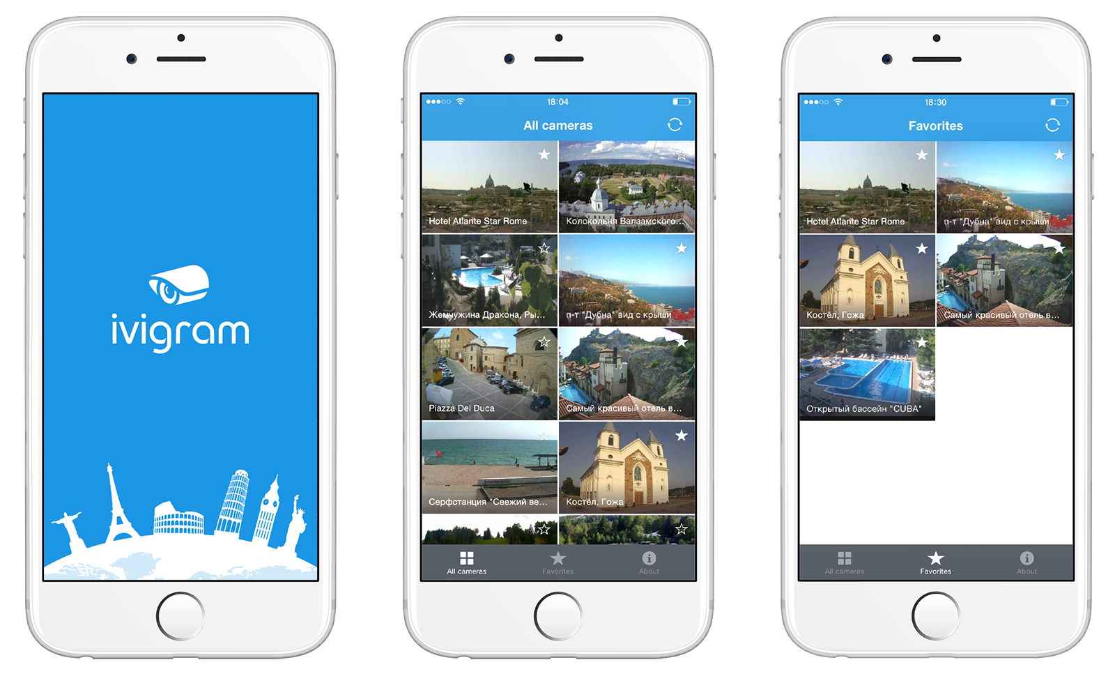
App name brainstorming and identity design
An obvious choice would be “Ivideon TV” for continuity with the desktop web app that presented similar functionality, but we wanted something more catchy and unique to build up web search presence and use in social media post hashtags. We listed multiple options paying attention to the names of competitor apps, and eventually landed on “Ivigram”, a wordplay on Ivideon and Instagram.
An obvious choice would be “Ivideon TV” for continuity with the desktop web app that presented similar functionality, but we wanted something more catchy and unique to build up web search presence and use in social media post hashtags. We listed multiple options paying attention to the names of competitor apps, and eventually landed on “Ivigram”, a wordplay on Ivideon and Instagram.
Ivigram app icon design:
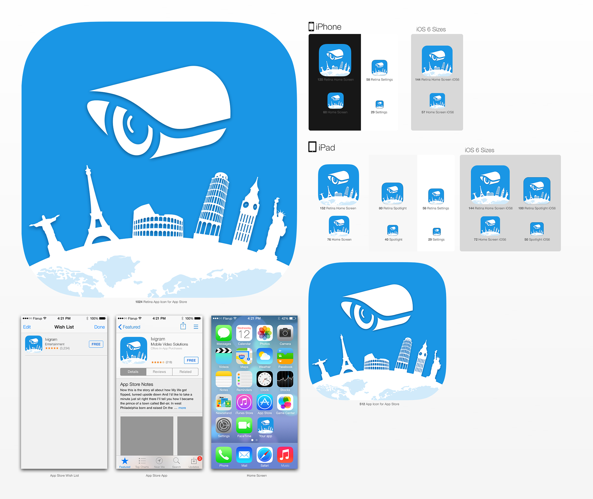
Ivigram is now available on the App Store.